Scoring genre clarity...

she danced in the wind like a holographic dream before the world died capsule

she danced in the wind like a holographic dream before the world died

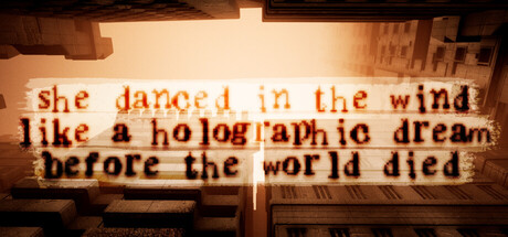
"The very last flower grew in concrete. She danced in the wind like a holographic dream before the world died." A short interactive poetry experience, and science fiction, about the end. Explore brutalist ruins to collect memories of a dead world.

$1.99Positive(19)
EmotionalPost-apocalypticHorror
alienmelonMar 4, 2026

she danced in the wind like a holographic dream before the world died scores 65/100 — better than 17% of Emotional capsules (n=1,056).

Positive (19 reviews) · $1.99 · Released Mar 4, 2026 · By alienmelon

Quick text summary

she danced in the wind like a holographic dream before the world died scored 65/100 on Steam Analyzer — Solid for a Emotional capsule. Top priority fix: [contrast_color] Introduce a single high-contrast light accent or focal element in the foreground to create a clear value anchor that survives reduction to TINY size.

Capsule scores by dimension

  • Genre Clarity: 7/10 — Poetic atmosphere, vague gameplay. The brutalist architecture, warm decay aesthetic, and holographic light effects clearly signal a contemplative indie experience rather than action or traditional narrative game. However, at TINY size the visual is mostly abstract texture and light—the interactive poetry and memory-collection mechanics are not visually evident, making genre identification rely more on artistic style than gameplay cues.
  • Title Readability: 5/10 — Readable at full, struggles at tiny. The text is legible at full header size with reasonable contrast against the warm architectural background, but the serif/slab font with heavy texture overlay becomes increasingly muddy as size reduces. At TINY size the words compress into a blur and individual letterforms lose definition, making it difficult to parse the full poetic message quickly during a scroll.
  • Contrast & Color: 6/10 — Warm tones fade into background. The warm beige and orange palette is cohesive and thematically appropriate for decay and memory, but the muted saturation and mid-tone dominance create limited separation from the Steam dark background when squinting or viewing at reduced size. The holographic light accents provide some value contrast, but the overall effect is atmospheric rather than bold—no single element pops decisively at small scale.
  • Uniqueness & Polish: 7/10 — Distinctive poetic mood, intentional craft. The brutalist ruin framing, holographic light language, and typographic poetry treatment create a cohesive and memorable artistic identity that feels premium and intentional rather than templated. The choices—warm decay palette, architectural geometry, overlay text as a core visual element—all reinforce the game's core theme of memory and world-end. This stands apart from action-oriented indie peers but may feel slightly too subtle for immediate discovery impact at tiny size.
  • Brand Consistency: 8/10 — Strong visual identity, poetic focus. The capsule establishes a distinctive brand voice through consistent use of brutalist architecture, warm golden-brown color grading, and typography as narrative content. The holographic dream aesthetic and text-as-primary-visual approach create iconic identity cues that should be recognizable across promotional materials. This level of intentional art direction suggests strong internal cohesion across the game's 16 store screenshots.
  • Composition: 6/10 — Centered text, layered but balanced. The composition uses a natural three-layer hierarchy: distant brutalist architecture, mid-ground light architecture, and foreground text. The text sits centered and legible in the safe area at full size, but at SMALL and TINY sizes the architectural detail and text begin to compete equally for attention, reducing focal clarity. The composition is competent but not optimized for the severe size reduction stress test—a more deliberate focal anchor would strengthen small-size readability.

What works

  • Thematic art direction. Brutalist architecture, warm decay palette, and holographic light effects work together to communicate poetic melancholy and world-end atmosphere distinctively.
  • Typography as narrative. The choice to foreground the poetic text as a primary visual element rather than a footer tagline creates a memorable and intentional brand hook.
  • Warm cohesive palette. The beige, orange, and golden tones create internal consistency and thematic unity without clashing or feeling generic.

What hurts the capsule

  • Texture obscures text clarity. The heavy architectural overlay and lighting effects reduce text legibility at small sizes, making the poetic message harder to parse during quick scroll.
  • Limited value separation. Warm mid-tones dominate without enough light-dark contrast to create a punchy silhouette or focal point that survives squinting or grayscale conversion.
  • Genre ambiguity at thumbnail scale. At TINY size the visual reads as atmospheric abstract art rather than a game mechanic, making it harder for discovery algorithms and quick scrollers to categorize or recognize the interactive poetry experience.

Priority fixes

  1. [contrast_color] Introduce a single high-contrast light accent or focal element in the foreground to create a clear value anchor that survives reduction to TINY size.
  2. [title_readability] Simplify or reposition the typographic overlay to a cleaner background region with less architectural texture interference, or increase letter weight to maintain definition at small scales.
  3. [composition] Establish a more deliberate single focal point at SMALL and TINY sizes—consider repositioning the strongest architectural or light element off-center to guide attention before text.
  4. [genre_clarity] Add a minimal visual gameplay cue—such as a subtle memory fragment icon, flower silhouette, or interaction hint—to signal the interactive poetry mechanic at thumbnail scale.

Store copy priority fixes

  1. [feature_communication] Add 1–2 sample poetry excerpts or story titles to the detailed description to give players a concrete sense of the writing quality and emotional register they will encounter.
  2. [genre_clarity] Clarify the scope and nature of 'open world' exploration—specify whether players can approach objectives in any order, if the map is large, or if 'open' refers to non-linear reading discovery rather than traditional exploration freedom.
  3. [feature_communication] Expand the gameplay loop with a concrete example: 'Float to a collapsed library, discover a poem about lost humanity, read it while the environment echoes its themes, add it to your collection' to demystify the moment-to-moment interaction.

Related guides

Steam app ID: 4430780 · Tags: Emotional, Post-apocalyptic, Horror, Philosophical, Dystopian