Scoring genre clarity...
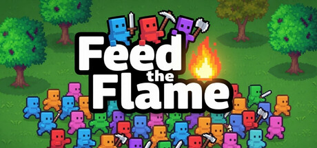
Feed The Flame is a simple incremental game where you grow a flame to burn down the world. Buy better resources, unlock upgrades and employ thousands of workers to mine, chop and hunt down fuel for the flame. Easy. Satisfying. Highly addictive.
$2.991 user reviews
CasualSimulationStrategy
RetnuhMar 27, 2026