Kombucha Craft scores 78/100 — better than 78% of Sandbox capsules (n=1,519).

Quick text summary

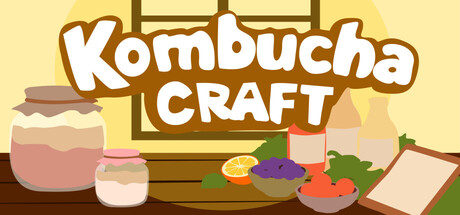
Kombucha Craft scored 78/100 on Steam Analyzer — Good for a Sandbox capsule. Top priority fix: [contrast_color] Add subtle darker outlines or shadows to ingredient silhouettes to increase edge definition and prevent midtone blending at tiny sizes

Capsule scores by dimension

  • Genre Clarity: 8/10 — Clear cozy crafting sim vibes. The capsule immediately communicates a crafting/simulation game through visible jar ingredients, vegetables, wooden workspace, and recipe-building visual language. At tiny size, the colored bottles and ingredient scatter still read as a crafting activity, though the specific kombucha theme becomes less obvious without text. The warm, domestic aesthetic strongly suggests cozy simulation rather than action or narrative game.
  • Title Readability: 9/10 — Bold, legible title hierarchy. The 'Kombucha CRAFT' text uses thick white letterforms with brown outline that maintain clarity at all sizes, including tiny thumbnails. The two-line stacked layout with larger primary word and secondary descriptor is intentional and effective. Title sits cleanly on pale yellow background with no competing texture underneath, ensuring readable silhouette even during quick scroll.
  • Contrast & Color: 8/10 — Warm palette pops against dark Steam. The pale yellow background (#F5E6D3 approximately) creates strong value separation from Steam's dark background #1b2838, with brown outlines providing edge definition. Colored jar elements (pink, purple, green accents) add visual interest without muddying the core contrast. At tiny size the yellow field and brown/white title maintain clear separation, though some midtone ingredients blend slightly into the background.
  • Uniqueness & Polish: 7/10 — Charming craft style, competent execution. The soft, hand-drawn aesthetic with rounded jar shapes and simplified ingredient illustrations creates a distinctive cozy-game feel appropriate to kombucha brewing. The woodgrain workspace, scattered herbs, and recipe-like arrangement show intentional visual storytelling around fermentation crafting. While the art style is polished and cohesive, it follows established cozy-sim visual conventions without a particularly memorable unique hook that sets it apart from similar titles like Dinkum or Spiritfarer.
  • Brand Consistency: 7/10 — Consistent cozy aesthetic, warm palette. The capsule maintains internal visual cohesion through consistent warm earthy tones (cream, brown, soft pink, muted green) and unified soft illustration style across all elements. The rounded, friendly letterforms and ingredient objects reinforce a unified craft-game brand identity. Without access to other store assets, the warm palette and illustration approach appear distinctive enough to be recognizable, though the style shares DNA with other cozy sims.
  • Composition: 8/10 — Well-balanced focal hierarchy, centered clarity. The title anchors strong at top-center with ingredients and workspace arranged naturally below, creating clear depth with foreground jars overlapping background wooden elements. No elements crowd the edges dangerously, and the yellow field provides breathing room around all objects. At small/tiny sizes the composition remains readable with title prominent and ingredient scatter supporting without overwhelming—only the rightmost carrot touches a soft edge without critical loss.

What works

  • Title maintains legibility at all sizes. Thick white letters with brown outline ensure 'Kombucha CRAFT' reads clearly even at tiny thumbnail scale with strong contrast against pale background.
  • Strong genre communication through visual metaphor. Scattered ingredients, brewing jars, and wooden workspace immediately signal fermentation crafting without text, creating intuitive genre recognition.
  • Warm palette pops against Steam dark background. The pale yellow field provides substantial value separation from #1b2838, making the capsule stand out during quick scroll browsing.
  • Intentional composition with clear focal hierarchy. Title anchors top, ingredients layer naturally below, creating depth and guiding eye without scattered competing focal points.

What hurts the capsule

  • Ingredient silhouettes lack crisp edge definition. Some midtone vegetables and jar elements blend softly into the pale background, reducing silhouette pop at very small sizes despite good overall contrast.
  • Generic cozy-sim visual approach. While well-executed, the soft rounded aesthetic and craft-workspace arrangement follow established conventions seen in many similar titles, lacking a distinctive visual signature.
  • Kombucha theme not explicit without text. At tiny size, the generic jars and ingredients read as general cooking/craft rather than specifically fermentation-focused; the kombucha identity relies entirely on title text.

Priority fixes

  1. [contrast_color] Add subtle darker outlines or shadows to ingredient silhouettes to increase edge definition and prevent midtone blending at tiny sizes
  2. [uniqueness_polish] Introduce a distinctive visual motif or character element unique to kombucha culture (e.g., SCOBY illustration, fermentation bubbles, branded jar) to differentiate from generic craft sims
  3. [genre_clarity] Include one visual element specific to fermentation (bubbles, fermentation jar with visible culture) to make kombucha theme readable without text at thumbnail size

Store copy priority fixes

  1. [hook_strength] Rewrite the short description to lead with an active, specific payoff: e.g., 'Master fermentation, craft wild flavor combos, and build your signature kombucha recipe from scratch' instead of the generic 'control every step.'
  2. [uniqueness] Add a single concrete differentiator in the detailed description: e.g., 'Unlock hundreds of ingredient combinations,' 'Track how your creations affect a fictional marketplace,' or 'Compete against historical kombucha styles' to distinguish this from generic crafting games.
  3. [feature_communication] Expand the detailed description by 1–2 sentences to clarify progression: Are there recipes to discover? A campaign? Endless sandbox? This gap actively hurts conversion for players unsure what 'mastery' looks like.

Related guides

Steam app ID: 4432660 · Tags: Sandbox, Simulation, Crafting, Management, Economy