Scoring genre clarity...
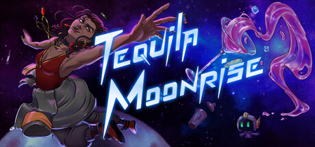
Tequila Moonrise capsule

Tequila Moonrise

Take over a struggling bar on the politically tense Moon Village. Prepare and serve drinks, befriend and help your customers, find your purpose, and maybe even love... all while keeping the bar's lights on in this narrative driven bartending simulator set on the moon.

Dialogue HeavyStory RichChoices Matter
Black Swan GamesComing soon

Tequila Moonrise scores 75/100 — better than 73% of Dialogue Heavy capsules (n=684).

Released Coming soon · By Black Swan Games

Quick text summary

Tequila Moonrise scored 75/100 on Steam Analyzer — Good for a Dialogue Heavy capsule. Top priority fix: [genre_clarity] Add subtle visual bartending cues (drink glass, bottles, or service counter) to reinforce the simulation/bartending genre and differentiate from generic space adventure.

Capsule scores by dimension

  • Genre Clarity: 7/10 — Casual sci-fi bartending narrative. The capsule clearly communicates a space setting through the moon backdrop and sci-fi aesthetic, with the character pose and bar environment suggesting a service/simulation game. At tiny size, the neon glow and colorful alien/fantasy character read as casual indie adventure rather than hardcore genre, which aligns with the narrative-driven bartending simulator positioning. The visual hierarchy supports genre recognition but doesn't scream 'bartending simulator' without context.
  • Title Readability: 8/10 — Bold neon title, clear at all sizes. The title 'Tequila Moonrise' uses bright cyan and white neon lettering positioned centrally with strong contrast against the dark space background and character. The letterforms remain legible at small size due to thick stroke weight and bright value separation. At tiny size the title maintains readability as a cohesive unit, though individual letter detail softens appropriately.
  • Contrast & Color: 8/10 — Strong neon pop with vivid palette. The design leverages high-saturation purples, magentas, and cyan against the dark space background, creating excellent silhouette separation and visual pop on Steam's dark theme. The character is well-lit with warm orange-red tones against cool backgrounds, and the neon title glows distinctly. In grayscale, the value separation remains strong between character, title, and background layers.
  • Uniqueness & Polish: 7/10 — Polished sci-fi aesthetic, moderate distinction. The art direction is clean and cohesive with a distinctive sci-fi-meets-bartending vibe, featuring well-rendered character animation and atmospheric nebula effects. The neon typography and color grading feel intentional and premium rather than templated. However, the composition follows fairly common indie game visual patterns—character on left, title center, abstract background effects—which limits standout uniqueness within the catalog of top performers.
  • Brand Consistency: 7/10 — Consistent sci-fi bartender identity. The capsule establishes a recognizable visual identity through the character design, neon aesthetic, and moon-bar setting that should carry through store screenshots. The color palette (warm character tones, cool neon, purple space) and art style appear intentional and branded. The identity is cohesive but not yet iconic enough to be instantly recognizable as 'Tequila Moonrise' without the logo.
  • Composition: 8/10 — Strong hierarchy, balanced layout. The character occupies the left-center focal point with commanding pose and lighting, while the title anchors the middle-right with secondary visual support from the colorful nebula effect. The composition layers clearly: foreground character, midground title and glow effects, background space environment. Safe margins protect key elements and the design remains readable at all three sizes without edge-collision concerns.

What works

  • Neon title legibility. The bright cyan and white lettering maintains clarity and visual impact from full size down to tiny thumbnail due to thick stroke weight and extreme contrast against dark background.
  • Sci-fi color grading. The vibrant magenta, purple, and cyan palette with warm character lighting creates strong visual separation and premium aesthetic that reads instantly on dark Steam background.
  • Clear focal hierarchy. The character pose and lighting command primary attention on the left, while the centered title and nebula effects support without competing, guiding the viewer's eye logically.
  • Thematic coherence. The moon setting, sci-fi character design, and bar environment work together to establish clear narrative context for the bartending simulator gameplay.

What hurts the capsule

  • Generic indie layout pattern. The left-aligned character plus centered title composition mirrors many successful indie games, reducing distinctiveness within the competitive casual game market.
  • Ambiguous gameplay communication. While the sci-fi bar setting is clear, the capsule does not visually emphasize bartending mechanics or the narrative-driven simulation aspect without prior knowledge.
  • Limited environmental storytelling. The background space and nebula effects are atmospheric but generic, not showcasing the moon village setting or the political tension mentioned in the description.

Priority fixes

  1. [genre_clarity] Add subtle visual bartending cues (drink glass, bottles, or service counter) to reinforce the simulation/bartending genre and differentiate from generic space adventure.
  2. [uniqueness_polish] Incorporate moon village architectural elements or signage into the background to establish distinctive setting and strengthen the 'moon bar' premise over generic sci-fi.
  3. [brand_consistency] Ensure the character design and neon aesthetic extend distinctively through store screenshots to build iconic recognition of the Tequila Moonrise identity.

Store copy priority fixes

  1. [hook_strength] Rewrite the short description opening to lead with the personal crisis ('A burned-out overachiever takes over a struggling moon bar with 30 days to save it—but your customers need help too') before setting details, to punch harder on emotional stakes.
  2. [feature_communication] Add a sentence explaining consequences of the 30-day timer: do you lose the bar and get a bad ending, or is it purely a narrative deadline? This clarifies the mechanical stakes.
  3. [uniqueness] Expand the sci-fi political backdrop into explicit connection to gameplay: does 'space capitalism' affect drink prices, customer disputes, or story branches? Show why the moon setting matters mechanically, not just aesthetically.

Related guides

Steam app ID: 4435080 · Tags: Dialogue Heavy, Story Rich, Choices Matter, Interactive Fiction, Casual