Scoring genre clarity...
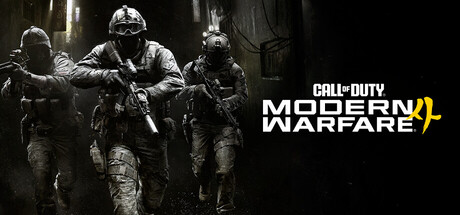
Call of Duty®: Modern Warfare® 4 capsule

Call of Duty®: Modern Warfare® 4

War erupts on the Korean Peninsula as North Korea launches an invasion that threatens to destabilize the world in Call of Duty®: Modern Warfare® 4.

$69.99
ActionShooterFPS
Infinity Ward, Beenox, Digital Legends, Activision Shanghai, Raven Software, Treyarch, Sledgehammer Games, High Moon StudiosOct 22, 2026

Call of Duty®: Modern Warfare® 4 scores 88/100 — better than 99% of Action capsules (n=8,838).

$69.99 · Released Oct 22, 2026 · By Infinity Ward

Quick text summary

Call of Duty®: Modern Warfare® 4 scored 88/100 on Steam Analyzer — Excellent for a Action capsule. Top priority fix: [uniqueness_polish] Consider incorporating an environmental or narrative detail that hints at the Korean Peninsula setting mentioned in the description to differentiate from generic military themes

Capsule scores by dimension

  • Genre Clarity: 9/10 — Military shooter instantly recognizable. Three heavily armed soldiers in tactical gear and body armor dominate the left side, immediately communicating a modern military shooter. At tiny size, the silhouettes of soldiers with rifles remain clearly legible and the combat-ready postures signal action-focused gameplay without ambiguity.
  • Title Readability: 9/10 — Bold white logo with gold accent. The "CALL OF DUTY MODERN WARFARE" text is rendered in clean sans-serif white with a distinctive gold underline accent beneath the Roman numeral IV. The logo maintains excellent readability at small and tiny sizes due to strong contrast against the dark background, with the gold accent providing a premium visual anchor.
  • Contrast & Color: 9/10 — Strong value separation throughout. The grayscale soldiers provide excellent mid to dark value separation against the pure black background, while the white title pops distinctly with the gold IV accent drawing additional focus. The lighting on the soldiers' armor and gear creates visible edge definition that survives squinting and remains clear at all viewing sizes.
  • Uniqueness & Polish: 8/10 — Polished military presentation, franchise standard. The capsule demonstrates professional lighting, texture work, and composition typical of AAA military franchises, with detailed armor textures and atmospheric fog creating depth. While the execution is excellent and the soldiers are convincingly rendered, the overall approach is consistent with franchise expectations rather than introducing a distinctive visual hook that differentiates this entry.
  • Brand Consistency: 9/10 — Iconic Call of Duty visual identity. The white sans-serif typography with gold accent, dark atmospheric aesthetic, and soldier-focused composition are instantly recognizable Call of Duty brand markers. The grayscale military aesthetic and the specific logo treatment create strong internal identity that aligns with series recognition cues visible across promotional materials.
  • Composition: 9/10 — Clear hierarchy with dominant focal point. Three soldiers occupy the left two-thirds with strong visual weight, while the title claims the right third with strategic spacing that avoids overcrowding. The composition maintains excellent balance and clear focal hierarchy at all sizes, with soldiers drawing immediate attention and the title providing clear secondary focus without competition or dead space.

What works

  • Iconic franchise branding. The white logo with gold accent and grayscale soldiers are instant Call of Duty visual signals that reinforce brand recognition and premium positioning.
  • Excellent contrast and legibility. Strong value separation between soldiers, background, and title text ensures the design reads clearly even at tiny thumbnail size with no visual collapse.
  • Professional composition and balance. Three soldiers provide strong left-side weight while the title anchors the right, creating natural visual flow and hierarchy without awkward spacing.
  • Genre clarity through silhouette. Tactical gear, rifles, and combat-ready postures immediately communicate military shooter gameplay without requiring readable details.

What hurts the capsule

  • Generic presentation within franchise. While well-executed, the soldier-focused composition and military aesthetic follow established Call of Duty templates without introducing a distinctive visual innovation.
  • Limited visual storytelling. The capsule relies on soldier silhouettes and brand identity rather than communicating a unique story element, setting detail, or core mechanic that differentiates this specific entry.

Priority fixes

  1. [uniqueness_polish] Consider incorporating an environmental or narrative detail that hints at the Korean Peninsula setting mentioned in the description to differentiate from generic military themes
  2. [composition] Evaluate whether adding subtle environmental context (terrain, destruction, setting markers) in the background could enhance distinctiveness while maintaining current visual hierarchy

Store copy priority fixes

  1. [uniqueness] Add a concrete differentiator for MW4: explain one signature mechanic, narrative twist, or feature that is new to this entry or the series—currently the copy reads as a generic franchise iteration.
  2. [feature_communication] Expand the Multiplayer section to include gunsmith/weapon customization details, map types, or progression systems—these are tagged but absent from the description.
  3. [audience_targeting] Add a sentence welcoming new players and explaining why MW4 is a good entry point, not just a loyalty message for veterans—currently it risks alienating fresh audiences.
  4. [hook_strength] Strengthen the short description by adding a gameplay-forward element after the Korean invasion setup—e.g., 'as North Korea launches an invasion… lead a squad through collapsing frontlines' to hint at player agency.

Related guides

Steam app ID: 4435490 · Tags: Action, Shooter, FPS, First-Person, Cinematic