Scoring genre clarity...
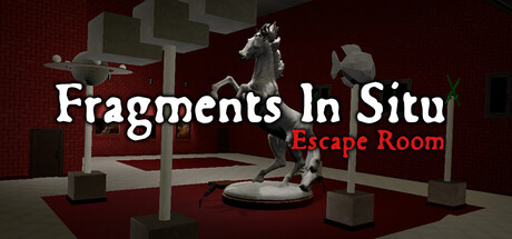
Fragments In Situ is a psychological escape room experience about coercion, fractured perception, and the fragile boundary between interpretation and reality. Will you complete every puzzle to solve your past?
$12.99No user reviews
IndieEscape RoomHidden Object
EIS GamesApr 30, 2026