Scoring genre clarity...

Exfil Void capsule

Exfil Void

A fast-paced twin-stick extraction shooter where you fight through procedurally generated space stations, grab Tech Cores, stack perks, and race to escape before the threat overwhelms you.

$6.991 user reviews
ActionAction RoguelikeRoguelike
Emberline StudiosMar 31, 2026

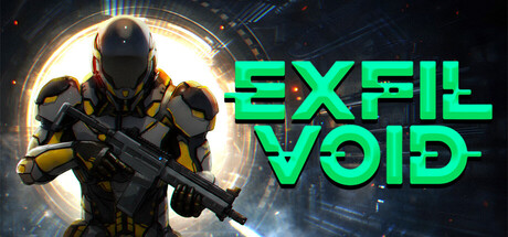
Exfil Void scores 78/100 — better than 85% of Action capsules (n=8,535).

1 user reviews · $6.99 · Released Mar 31, 2026 · By Emberline Studios

Quick text summary

Exfil Void scored 78/100 on Steam Analyzer — Good for a Action capsule. Top priority fix: [composition] Increase left margin by shifting the character and halo effect 15-20 pixels right to create safer edge clearance and improved balance.

Capsule scores by dimension

  • Genre Clarity: 8/10 — Clear sci-fi shooter action stance. The armored figure in combat pose with a rifle against a futuristic circular backdrop immediately communicates action gameplay and sci-fi setting. At TINY size, the silhouette and weapon remain recognizable as a shooter, though the specific extraction-mechanics twist is not visually apparent from the art alone. The glowing tech aesthetic and tactical armor reinforce the sci-fi shooter genre convincingly.
  • Title Readability: 9/10 — Bright neon title crystal clear. The bright cyan/green neon title text 'EXFIL VOID' uses a bold, sans-serif geometric typeface positioned prominently on the right side with strong contrast against the dark background. At SMALL and TINY sizes, the title remains fully legible with no collapse or blur, and the neon glow effect adds visual appeal without sacrificing clarity. The spacing and weight are deliberate and professional.
  • Contrast & Color: 9/10 — Excellent value separation and pop. The bright neon cyan title pops dramatically against the dark #1b2838 background, while the character's golden armor and bright white/yellow halo create a secondary focal point with equally strong separation. The grayscale test shows clear silhouette definition between the armored figure, its backlit glow, and the blue tech environment. The overall warm-cool contrast (golden armor vs. cool blue tech) creates visual harmony while maintaining crisp readability at all sizes.
  • Uniqueness & Polish: 7/10 — Solid execution with generic sci-fi bones. The capsule demonstrates clean craft with professional lighting (backlit halo effect), well-rendered armor detail, and cohesive color grading. However, the overall composition—armored soldier against glowing tech backdrop—follows familiar action shooter conventions seen across HELLDIVERS 2, Warhammer 40K, and similar titles. The neon title treatment and cyan accent color provide some visual personality, but the core scene lacks a distinctive hook that would separate it from mid-tier sci-fi shooters.
  • Brand Consistency: 6/10 — Competent but minimal identity signals. The golden armor and cyan neon palette are consistent within this capsule, but without reference to other brand materials, there are no distinctive motifs, iconic symbols, or signature design cues that would make Exfil Void immediately recognizable on repeat viewing. The tech aesthetic and color scheme are competent but shared across many indie and AAA sci-fi shooters, offering no memorable brand anchor that differentiates this title's visual identity.
  • Composition: 8/10 — Strong hierarchy with balanced layout. The armored figure is centered and serves as the primary focal point, with the bright halo directing the eye upward, while the title text anchors the right side without competing for attention. The composition creates good depth layering: background tech environment, midground character, and foreground glow effects. At TINY size, the clear figure-text separation and balanced spacing maintain strong hierarchy, though the character approaches the left edge slightly and could benefit from more margin protection.

What works

  • Neon title executes flawlessly. The bright cyan 'EXFIL VOID' text maintains perfect legibility and visual pop at all sizes, from full header to tiny thumbnail, with strategic placement that does not compete with the focal character.
  • Strong backlit silhouette effect. The golden armor with bright white halo creates exceptional contrast and depth, making the armored figure instantly readable even at TINY size with clear edges and separation from the background.
  • Professional color harmony. The warm-cool contrast between golden armor, cyan neon text, and cool blue tech environment creates visual appeal without muddy mid-tones, reading clearly even in grayscale.
  • Clean focal point hierarchy. The centered character and right-anchored title create balanced composition with no scattered attention or competing elements at SMALL and TINY sizes.

What hurts the capsule

  • Generic sci-fi soldier scene. The core composition—armored figure with rifle against glowing tech backdrop—follows conventions shared by HELLDIVERS 2, Warhammer 40K, and many AAA action shooters, lacking distinctive visual storytelling.
  • No unique brand identity signals. The capsule contains no iconic motifs, signature symbols, or memorable design elements that would make Exfil Void visually recognizable as a distinct title on repeat encounters.
  • Left edge character proximity. The armored figure's left shoulder sits close to the edge, creating minimal safe margin and potential cropping risk on certain Steam display contexts.
  • Extraction mechanic not communicated visually. The capsule conveys 'action shooter' clearly but omits any visual cue suggesting the procedural-generation, tech-core-gathering, or time-pressure mechanics that differentiate Exfil Void from standard shooters.

Priority fixes

  1. [composition] Increase left margin by shifting the character and halo effect 15-20 pixels right to create safer edge clearance and improved balance.
  2. [uniqueness_polish] Add a subtle visual element that hints at core mechanics—consider a floating tech core, radar scan effect, or extraction portal in the background to communicate the unique extraction-shooter hook.
  3. [brand_consistency] Introduce a distinctive visual motif or signature element (custom HUD accent, logo mark, or color accent) that could appear consistently across promotional materials to build brand recognition.

Store copy priority fixes

  1. [uniqueness] Add a specific example of how the perk system creates emergent builds or a concrete weapon unlock that exemplifies progression, e.g., 'Stack plasma amplifiers with reload perks to chain rapid-fire fusion bursts'
  2. [feature_communication] Include 1-2 sentences describing visual style and how the isometric perspective or art direction enhances readability during fast action
  3. [audience_targeting] Specify estimated run length (e.g., '10-minute intense runs') to reinforce the short-burst gameplay appeal and differentiate from longer roguelikes
  4. [hook_strength] Consider opening the detailed description with a single sensory detail or scenario hook before pivoting to mechanics, e.g., 'Alarms blare as the station decompresses around you—grab the Tech Core and run.'

Related guides

Steam app ID: 4445140 · Tags: Action, Action Roguelike, Roguelike, Shooter, Looter Shooter