Scoring genre clarity...
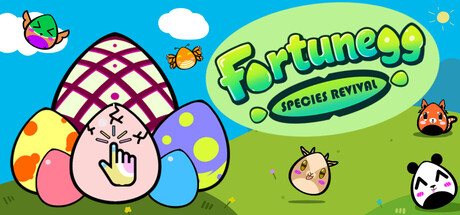
A one-button game where failure is progress, inaction is a choice, and luck is never entirely fair. Discover every egg, stage, secret, and animal while putting your fortune to the test. It’s a piece of cakegg!
$2.491 user reviews
IncrementalCreature CollectorFunny
Twisted GamesMay 8, 2026