Scoring genre clarity...

Wizards and Warlocks capsule

Wizards and Warlocks

A dimly-lit PvPvE experience. Cast spells with your voice to kill your enemies and/or capture the Crystal objectives to banish them back to the lobby of purgatory.

$1.99
MultiplayerActionMedieval
Ethan HaizeMar 27, 2026

Wizards and Warlocks scores 68/100 — better than 13% of Multiplayer capsules (n=2,820).

$1.99 · Released Mar 27, 2026 · By Ethan Haize

Quick text summary

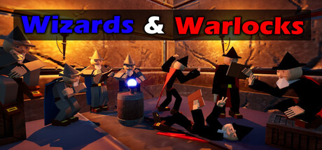
Wizards and Warlocks scored 68/100 on Steam Analyzer — Solid for a Multiplayer capsule. Top priority fix: [uniqueness_polish] Introduce a signature visual element or character design that distinguishes Wizards & Warlocks from generic fantasy games—consider an iconic crystal motif, branded robe color, or distinctive art style treatment that signals the voice-casting premise.

Capsule scores by dimension

  • Genre Clarity: 7/10 — Fantasy action with clear spellcasting. The capsule communicates a fantasy PvP action game through multiple readable cues: silhouetted wizards in robes, glowing magical effects (blue orb center, red energy trails), and arcane spell-casting poses. At TINY size, the glowing orb and character silhouettes still register as magical combat, though specific genre nuance (voice-cast mechanics, PvPvE crystal objective) is lost. The warm orange environment and dark robes anchor the fantasy setting convincingly.
  • Title Readability: 8/10 — Strong color contrast, clear hierarchy. The title uses bold sans-serif lettering with blue and red color separation that contrasts well against the dark background. 'Wizards' in blue and 'Warlocks' in red create visual distinction and memorability. At SMALL size the text remains legible; at TINY size the words compress but the color blocks still signal two distinct terms, maintaining recognizability even if letter details soften.
  • Contrast & Color: 8/10 — Vibrant glows against dark foundation. Strong value separation between the dark silhouettes, warm orange ambient lighting, and bright blue/red magical effects creates depth and visual pop. The glowing orb at center and red energy trails read clearly in both color and grayscale, with silhouettes maintaining sharp edges against the warm background. At TINY size, the bright focal point (blue orb) and warm-cool color contrast sustain legibility and visual hierarchy.
  • Uniqueness & Polish: 6/10 — Competent but visually familiar. The scene presents a well-lit fantasy action setup with professional lighting and particle effects, but the composition—robed figures in an arena-like space with magical effects—follows common fantasy game imagery conventions seen across many titles. The voice-cast mechanic and PvPvE focus are gameplay differentiators not visually communicated, and no distinctive art style or branded visual hook elevates this above competent baseline. Polish is solid but the visual hook lacks memorable distinctiveness.
  • Brand Consistency: 5/10 — No coherent brand identity signals. The capsule presents a generic fantasy arena scene without iconic character designs, signature color palette, or recognizable motifs that would carry forward to other assets. The blue-and-red title treatment is functional but not tied to a larger visual identity system. Without access to the full 5-screenshot reference set, no clear brand signature is evident in this single capsule; the image communicates setting but not distinctive brand personality.
  • Composition: 7/10 — Balanced focal point with clear hierarchy. The bright blue orb at center acts as the primary focal point, surrounded by wizard silhouettes that frame and lead the eye inward. Title placement at top is clear and does not encroach on safe margins. Depth is created through foreground characters, midground effects, and warm background lighting. At SMALL size the composition reads cleanly; at TINY size the central glow and silhouettes maintain focal clarity, though some character detail compresses.

What works

  • Strong title contrast and color coding. Blue and red title text with bold sans-serif treatment pops clearly against the dark background and remains readable at small sizes due to color separation and weight.
  • Clear fantasy action silhouettes. Robed wizard figures and glowing magical effects (blue orb, red energy) immediately signal the genre and create recognizable character poses even at TINY size.
  • Effective value and color contrast. Warm orange ambient lighting and bright magical glows separate cleanly from dark silhouettes, maintaining visual pop and edge clarity in both color and grayscale evaluation.
  • Centered focal point hierarchy. The glowing blue orb anchors visual attention at center with surrounding figures framing it naturally, preventing scattered composition at any size.

What hurts the capsule

  • Generic fantasy setting without visual distinctiveness. The arena scene with robed mages and magical effects closely mirrors common fantasy game imagery, lacking a unique art style or signature visual hook that would differentiate it from peers.
  • No visible brand identity markers. Absence of iconic characters, distinctive motifs, or signature palette that would make this capsule recognizable as belonging to a specific game brand across multiple touchpoints.
  • Voice-cast and PvPvE mechanics not visually communicated. Key gameplay differentiators (voice-controlled spellcasting, crystal objectives, banish mechanic) are invisible in the capsule, leaving viewers to infer a standard fantasy action game rather than a unique premise.

Priority fixes

  1. [uniqueness_polish] Introduce a signature visual element or character design that distinguishes Wizards & Warlocks from generic fantasy games—consider an iconic crystal motif, branded robe color, or distinctive art style treatment that signals the voice-casting premise.
  2. [brand_consistency] Establish a cohesive color palette and visual identity system (beyond blue/red title text) that would carry recognizably across all marketing assets and store screenshots.
  3. [genre_clarity] Add subtle UI or environmental cues hinting at the voice-control mechanic or crystal objective system—a glowing crystal, voice waveform, or objective marker—to communicate the unique selling point.

Store copy priority fixes

  1. [hook_strength] Rewrite the short description to lead with 'Cast spells with your voice' instead of 'dimly-lit,' making the unique mechanic the first hook rather than atmosphere.
  2. [tone_match] Remove or relocate developer notes (bugs section, price explanation, personal aspirations) to a separate 'Developer Notes' section or community post to maintain store page polish and marketing focus.
  3. [feature_communication] Add a brief 'Spell System' or 'Your Arsenal' section that lists spell types, count, and how players acquire/customize their spellbooks beyond page duplication.
  4. [audience_targeting] Add a sentence clarifying the skill floor and competitive intensity (e.g., 'casual team fun' vs 'competitive ladder') to help the right players self-identify immediately.

Related guides

Steam app ID: 4448610 · Tags: Multiplayer, Action, Medieval, PvP, Magic