Scoring genre clarity...

Click and Stack capsule

Click and Stack

Click and Stack is a short incremental game about stacking and balancing treasures to get rich!

$2.99No user reviews
CasualIncrementalPoint & Click
SakrSoftMar 27, 2026

Click and Stack scores 85/100 — better than 97% of Casual capsules (n=10,153).

No user reviews · $2.99 · Released Mar 27, 2026 · By SakrSoft

Quick text summary

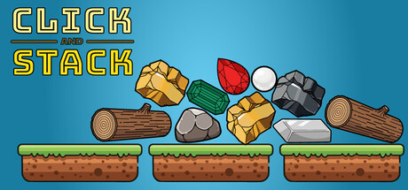
Click and Stack scored 85/100 on Steam Analyzer — Excellent for a Casual capsule. Top priority fix: [uniqueness_polish] Consider adding a subtle character or hand element interacting with the treasures to hint at the 'clicking' action and create a more memorable mascot identity.

Capsule scores by dimension

  • Genre Clarity: 8/10 — Clear casual clicker with stacking mechanic. The visual immediately communicates a casual, puzzle-based stacking game through the prominent treasure items (gold bars, gems, wood logs) arranged on three platform layers. At TINY size, the stacked objects and three-tier platform structure remain readable and clearly signal an incremental/stacking gameplay loop. The bright, cheerful art style and simple object silhouettes reinforce casual, low-stakes gameplay intent.
  • Title Readability: 9/10 — Excellent bold title with strong contrast. The 'CLICK AND STACK' title uses a thick yellow outline font with dark blue stroke on the light blue background, creating exceptional clarity at all sizes. At TINY size, the two-line stacked text remains fully legible with clear letter forms and strong value separation from the background. The strategic placement at top left avoids collision with game elements and maintains readability under quick scroll conditions.
  • Contrast & Color: 9/10 — Strong value separation with vibrant palette. The light blue background (#4BA3C3 approximate) creates excellent contrast against the bright yellow title, brown wood, gold bars, red gems, and green elements. Each treasure item has a distinct, saturated color with strong dark outlines that pop cleanly against the background even at TINY size. The grayscale test shows clear silhouettes throughout; no muddy mid-tones obscure the read.
  • Uniqueness & Polish: 8/10 — Polished vector art with strong identity. The capsule demonstrates clean, intentional craft with consistent cartoon-style vector rendering across all elements and a cohesive pastel-meets-vibrant color palette. The three-tier platform layout and treasure variety communicate a specific 'stacking puzzle' identity rather than generic casual game. The illustration quality and consistent outline style suggest premium indie craft that stands out against template-based competitor capsules.
  • Brand Consistency: 8/10 — Consistent art direction with memorable motif. The capsule establishes a clear visual identity through the repeating three-tier platform structure, consistent vector outline style, and a distinctive treasure-stacking motif that directly reflects gameplay. The warm color palette (yellows, oranges, browns) and cartoonish proportions create a recognizable brand signature. The simplicity and specificity of the stacking mechanic visual make this design memorable and identifiable across other marketing materials.
  • Composition: 9/10 — Clear hierarchy with balanced focal points. The title sits securely at top left with ample safe margin, while the three platforms with stacked treasures occupy the center and lower two-thirds, creating a natural reading flow and strong focal point. At SMALL and TINY sizes, the composition maintains clarity with no element fighting for attention; the platforms anchor the design. The balanced horizontal three-column platform structure and centered treasure arrangement prevent dead space or awkward void areas.

What works

  • Excellent title legibility at all sizes. Yellow outline bold font on light blue delivers perfect readability at TINY thumbnail size with zero letterform collapse.
  • Vibrant, high-contrast palette. Saturated treasure colors (gold, red, green) with dark outlines create instant visual pop against the light blue background and remain distinct in grayscale.
  • Strong visual metaphor for gameplay. The three-tier stacking platform with varied treasures directly communicates the core stacking and balancing mechanic without need for additional UI.
  • Polished vector craft and consistency. Clean outline style, coherent proportions, and consistent rendering across all elements convey premium indie quality that stands out.

What hurts the capsule

  • Limited narrative depth in visual storytelling. While the stacking mechanic is clear, the capsule does not hint at the 'get rich' progression loop or incremental gameplay evolution beyond initial stacking.
  • No character or mascot presence. Unlike top-performing casual indie games (Balatro, Little Kitty, DAVE THE DIVER), the design lacks a memorable character or agent that could become a brand icon.

Priority fixes

  1. [uniqueness_polish] Consider adding a subtle character or hand element interacting with the treasures to hint at the 'clicking' action and create a more memorable mascot identity.
  2. [genre_clarity] Add a small progression indicator (coin counter, wealth symbol) to hint at the incremental wealth-building aspect and differentiate from static stacking puzzles.

Store copy priority fixes

  1. [feature_communication] Expand the detailed description to 150+ words and add specific examples: 'Unlock relics like [specific relic name] that multiply your stacking speed' or 'Balance treasures against physics to earn bonuses.' Currently it is too vague to understand gameplay.
  2. [hook_strength] Rewrite the opening to lead with what makes stacking engaging: 'Stack colorful treasures in increasingly impossible formations, then watch physics topple your tower for riches' rather than generic 'Click and stack treasure blocks!'
  3. [uniqueness] Add one concrete differentiator: either a specific mechanic unique to balancing/physics, a visual or thematic hook, or a progression hook that explains why this idle game is worth playing over competitors.
  4. [feature_communication] Clarify the balancing mechanic: does it require skill, does it affect income, are there levels or challenges, or is it purely aesthetic? This seems like the game's hook and it is completely unexplained.

Related guides

Steam app ID: 4453840 · Tags: Casual, Incremental, Point & Click, Idler, Indie