Scoring genre clarity...
Scoring genre clarity...
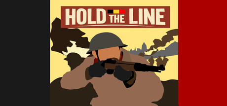
Hold the Line scores 77/100 — better than 78% of Strategy capsules (n=5,436).
3 user reviews · $4.99 · Released Mar 13, 2026 · By Adrien De Nève
Hold the Line scored 77/100 on Steam Analyzer — Good for a Strategy capsule. Top priority fix: [uniqueness_polish] Introduce a distinctive visual element or symbol (such as trench fortification details, supply crates, or a morale/fatigue indicator) that signals tower defense mechanics and differentiates from generic WWI military games.
Steam app ID: 4454190 · Tags: Strategy, Tower Defense, Management, Tactical, 2D