Scoring genre clarity...

The Ocean is not Water capsule

The Ocean is not Water

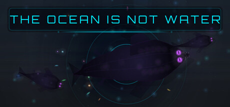
An eldritch incremental game where you are an ancient shark devouring fish, reality, and the concept of depth itself. Hunt with sonar, collect bioluminescent jellyfish, command a brood, dream the dreams of dead gods, and descend through layers of cosmic progression. The ocean is not water.

$4.993 user reviews
SimulationStrategyAuto Battler
SharkeyMar 12, 2026

The Ocean is not Water scores 73/100 — better than 51% of Simulation capsules (n=5,188).

3 user reviews · $4.99 · Released Mar 12, 2026 · By Sharkey

Quick text summary

The Ocean is not Water scored 73/100 on Steam Analyzer — Good for a Simulation capsule. Top priority fix: [genre_clarity] Introduce a subtle shark silhouette or feeding/consumption visual metaphor to signal the incremental progression and devouring core mechanic at SMALL size.

Capsule scores by dimension

  • Genre Clarity: 7/10 — Eldritch mystery with aquatic theme. The dark underwater aesthetic with bioluminescent elements (purple and cyan dots) and the mention of sonar/sharks in the description hint at an aquatic progression game, but the abstract cosmic visuals and title crypticism make the genre feel deliberately obscured. At TINY size, it reads as mysterious ocean-adjacent rather than clearly identifying as an incremental/idle game, which is the actual core mechanic.
  • Title Readability: 8/10 — Clean cyan text, excellent contrast. The title 'THE OCEAN IS NOT WATER' is rendered in a bright cyan/neon font with a subtle border frame against the dark background, maintaining strong legibility at all sizes. At TINY size the text collapses slightly but remains identifiable due to high contrast and simple sans-serif letterforms. The framing box helps anchor the title and prevents it from blending into the background noise.
  • Contrast & Color: 8/10 — Strong cyan-to-dark separation. The cyan title and purple/magenta bioluminescent accents create distinct value separation against the very dark blue-black background (#1b2838 equivalent). The glowing dots and curved sonar lines in cyan and purple maintain clear silhouettes even at small sizes, and the overall palette avoids muddy mid-tones. In grayscale, the title remains highly legible and the background elements retain enough tonal variation to prevent collapse.
  • Uniqueness & Polish: 7/10 — Cosmic eldritch aesthetic, premium execution. The design commits to a cohesive visual philosophy of abstract underwater-cosmic mystery with intentional use of sonar arcs, particle effects, and bioluminescent iconography that aligns with the game's core conceit about reality distortion. The styling feels premium and intentional rather than asset-heavy, but the abstract nature means it doesn't immediately communicate the incremental game mechanic that defines the actual experience, placing it above baseline but not exceptional for discovery.
  • Brand Consistency: 7/10 — Consistent eldritch underwater identity. The cyan neon aesthetic, bioluminescent purple accents, sonar visual language, and dark cosmic background create a recognizable internal identity that should carry across store screenshots referenced in the description. The visual motifs (sonar curves, glowing orbs, void darkness) reinforce the core narrative of ancient entity and reality dissolution. However, without seeing the full store context, it's difficult to assess whether this feels like a signature brand versus a cohesive one-off design.
  • Composition: 7/10 — Centered focal point, clear hierarchy. The title anchors the top third with a framed border, while sonar arcs and bioluminescent clusters form a secondary focal point in the center-lower region, creating depth layering from foreground text to background cosmic elements. At SMALL and TINY sizes the composition reads cleanly with the title dominating attention, though the scattered particle clusters could create slight distraction. The layout respects safe margins and avoids edge hugging, though the distributed glowing elements lack a single unambiguous primary subject beyond the title itself.

What works

  • High-contrast cyan title. Bright neon cyan text with subtle framing maintains excellent readability against dark background at all viewing sizes, ensuring the title is the first thing parsed.
  • Cohesive eldritch-aquatic aesthetic. Sonar arcs, bioluminescent dots, and cosmic void create a unified visual language that reinforces the game's core narrative premise of reality distortion in an ancient ocean.
  • Strong value contrast and silhouettes. Purple and cyan elements separate cleanly from the dark background in both color and grayscale, ensuring visibility during quick scrolls and at thumbnail sizes.

What hurts the capsule

  • Genre ambiguity at small sizes. The abstract cosmic visuals obscure that this is an incremental/idle game, instead reading as a mystery or adventure title, which may reduce discoverability for players actively seeking progression games.
  • Scattered focal elements. The bioluminescent clusters and sonar curves distribute attention across the canvas rather than creating a single unambiguous subject, potentially making the composition feel abstract rather than gameplay-focused at TINY size.
  • Limited visual storytelling of core mechanic. While thematically strong, the capsule does not visually communicate hunting, devouring, or progression systems that define the actual gameplay experience, relying instead on cryptic atmosphere.

Priority fixes

  1. [genre_clarity] Introduce a subtle shark silhouette or feeding/consumption visual metaphor to signal the incremental progression and devouring core mechanic at SMALL size.
  2. [composition] Consolidate the lower bioluminescent clusters into a more cohesive secondary focal point that guides the eye from title toward a single recognizable subject rather than scattered elements.
  3. [uniqueness_polish] Add a distinctive icon or motif (e.g., a stylized ancient rune, shark eye, or sonar pulse symbol) that could serve as a brand-recognition mark across store pages and future releases.

Store copy priority fixes

  1. [genre_clarity] Add a single line to the short description explicitly stating 'Active-Idle Hybrid' or 'Hunt actively or let your brood feed you while you're away' to immediately clarify the gameplay loop hybrid nature.
  2. [audience_targeting] Add a parenthetical or opening sentence in the detailed description addressing who this is for, such as 'For players who love cosmic horror, incremental progression, and lore that rewards deep attention' to anchor audience expectations.
  3. [feature_communication] In the short description, replace or augment 'descent through layers of cosmic progression' with a more explicit reference to the prestige/reset mechanic (e.g., 'three prestige transformations') so players understand the core incremental loop upfront.

Related guides

Steam app ID: 4455790 · Tags: Simulation, Strategy, Auto Battler, Farming Sim, Incremental