Scoring genre clarity...

Chug Master Chuck capsule

Chug Master Chuck

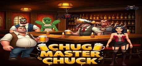
Step into the wild world of Chug Master Chuck! Sling beers, dodge hazards, and outwit rowdy foes in this action-packed retro 2D platformer. Can you conquer the craziest bar on the block? Cheers to the challenge!

$5.00
Precision Platformer2D PlatformerPlatformer
Coil EntertainmentMar 23, 2026

Chug Master Chuck scores 70/100 — better than 27% of Precision Platformer capsules (n=784).

$5.00 · Released Mar 23, 2026 · By Coil Entertainment

Quick text summary

Chug Master Chuck scored 70/100 on Steam Analyzer — Good for a Precision Platformer capsule. Top priority fix: [uniqueness_polish] Add a distinctive gameplay moment or mechanic cue (e.g., beer arc trajectory, dodge silhouette, or hazard indicator) to communicate the core action loop and differentiate from generic bar scenes.

Capsule scores by dimension

  • Genre Clarity: 7/10 — Bar-themed action platformer readable. The bar setting with bottles, tap, and rowdy characters clearly signals a casual action game with comedic tone. At TINY size, the vibrant green character and bar environment still communicate the genre premise, though specific platformer mechanics are less obvious. The beer-slinging core mechanic is evident from the full view but becomes harder to parse at smaller sizes.
  • Title Readability: 8/10 — Bold gold text stands out well. The yellow-gold "CHUG MASTER CHUCK" title uses a thick, rounded sans-serif font with strong contrast against the darker bar background and dark Steam interface. At SMALL size the text remains clearly legible; at TINY size the letterforms hold up reasonably well though character detail softens slightly. The title placement is centered and unobstructed, avoiding clutter.
  • Contrast & Color: 8/10 — Warm tones pop against dark interface. The golden-yellow title and warm amber lighting throughout create strong value separation from the #1b2838 Steam background. Character silhouettes (the chunky protagonist, green character, seated figure) read clearly even when squinting, and the saturated beer-colored palette provides visual punch. The orange-brown wooden bar interior maintains brightness hierarchy without muddiness.
  • Uniqueness & Polish: 6/10 — Competent retro aesthetic, generic execution. The bar setting and character lineup communicate the game's casual, comedic personality, but the composition feels like a straightforward character lineup rather than a distinctive moment or unique mechanic showcase. The art style is clean and purposeful for an indie title, yet it reads as a fairly standard bar-scene template without a standout hook or premium visual storytelling element. The craft is solid but not memorable enough to stand out in a crowded casual indie space.
  • Brand Consistency: 6/10 — Coherent bar world, limited icon identity. The color palette (warm amber, gold, browns) and character designs are internally consistent and clearly belong to the same world. However, there is no iconic character motif, signature symbol, or memorable visual hook that would make this capsule instantly recognizable on repeat viewing. The aesthetic is functional and cohesive but lacks a strong brand identity cue beyond the title.
  • Composition: 7/10 — Clear focal hierarchy with balanced layout. The green character and protagonist occupy strong center-left and left positions, drawing immediate attention, while supporting characters and bar elements frame the scene without competing for focus. At SMALL and TINY sizes, the character lineup still reads as distinct subjects with the golden title anchoring the bottom. The depth layering (foreground characters, background bar and shelves) creates visual interest, though the composition is fairly symmetrical and predictable.

What works

  • Strong warm color contrast. The amber and gold tones create excellent value separation from the dark Steam background, ensuring the capsule pops on the storefront.
  • Readable title at all sizes. The thick, centered yellow-gold text maintains legibility from full header down to TINY thumbnail sizes without collapsing.
  • Clear character silhouettes. Distinct character shapes and poses immediately communicate a multiplayer or cast-driven game with comedic tone.

What hurts the capsule

  • Generic scene composition. The lineup of characters in a bar feels like a standard template rather than a distinctive moment or unique visual hook that sets it apart.
  • Weak brand identity signal. No iconic character, symbol, or signature visual motif that would make the capsule instantly recognizable on repeat viewing or in genre-wide context.
  • Platformer mechanics unclear at small size. While the bar setting is obvious, the specific action-platformer gameplay (beer-slinging, hazard-dodging) is not visually communicated through UI hints or pose cues that would be readable at TINY size.

Priority fixes

  1. [uniqueness_polish] Add a distinctive gameplay moment or mechanic cue (e.g., beer arc trajectory, dodge silhouette, or hazard indicator) to communicate the core action loop and differentiate from generic bar scenes.
  2. [brand_consistency] Introduce a memorable visual motif or iconic element (character expression, signature prop, or color accent) that could serve as a recognizable brand identity across future marketing.
  3. [genre_clarity] Include a subtle UI element or action pose that clarifies the platformer genre at TINY size, such as a platform hint or player in mid-jump pose.

Store copy priority fixes

  1. [hook_strength] Replace 'Step into the wild world of Chug Master Chuck!' with a verb-forward hook like 'Master the art of beer-slinging: throw explosive bottles, dodge deadly hazards, and climb to the top of the leaderboards' to lead with unique mechanic rather than generic entry point.
  2. [audience_targeting] Add a single sentence after the short description clarifying difficulty and audience, such as 'Perfect for casual arcade fans and speedrunners seeking a fun, fast-paced challenge' to signal who should buy this game.
  3. [uniqueness] Add one sentence in the opening paragraph explicitly comparing or contrasting to similar games, such as 'Unlike traditional platformers, every weapon is a consumable projectile that rewards careful aim' to emphasize what makes this mechanically different.

Related guides

Steam app ID: 4458370 · Tags: Precision Platformer, 2D Platformer, Platformer, Action, Arcade