Scoring genre clarity...

Wardens of Wen capsule

Wardens of Wen

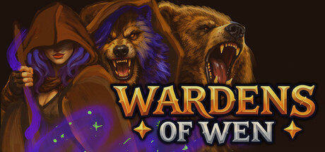
Wave-based top-down survival in a dark medieval realm. Pick a Warden, build your kit between waves, chase risk-reward hot-zones, and survive escalating enemy mutations and milestone bosses. How long can you survive?

$6.99Positive(12)
Early AccessAction RoguelikeHack and Slash
Zachary KaiserMar 25, 2026

Wardens of Wen scores 77/100 — better than 77% of Early Access capsules (n=3,067).

Positive (12 reviews) · $6.99 · Released Mar 25, 2026 · By Zachary Kaiser

Quick text summary

Wardens of Wen scored 77/100 on Steam Analyzer — Good for a Early Access capsule. Top priority fix: [genre_clarity] Add wave or enemy mutation visual element—such as a dark swarm silhouette, corrupted creature detail, or escalating enemy tier indicator—to communicate survival-wave gameplay beyond standard character class selection.

Capsule scores by dimension

  • Genre Clarity: 8/10 — Dark fantasy action RPG clear. The three character archetypes (hooded mage with purple aura, aggressive beast warrior, roaring bear) immediately signal action-oriented fantasy combat and class selection mechanics. At TINY size, the aggressive poses, fantasy armor, and supernatural effects (purple glow, magic aura) remain readable and strongly communicate a dark medieval action game. The composition avoids ambiguity about genre despite the indie scale.
  • Title Readability: 8/10 — Bold gold text strong presence. WARDENS OF WEN uses a prominent, all-caps gold serif font with clean letterforms and solid contrast against the dark background. The title remains legible at SMALL and TINY sizes due to thick weight and high saturation; the star decorators flanking the text add visual interest without cluttering. Gold-on-dark is a reliable contrast pair that holds well under quick scroll conditions.
  • Contrast & Color: 8/10 — Strong gold-purple value separation. The gold title and character highlights create excellent value separation against the deep brown-black background. Purple magical accents on the left figure add secondary color contrast that reinforces the fantasy tone. In grayscale, the bright gold and purple read as distinct light values against dark, maintaining silhouette clarity even at TINY size; no muddy blending occurs.
  • Uniqueness & Polish: 7/10 — Polished character art, familiar execution. The three character illustrations show strong render quality with detailed lighting, shading, and dynamic poses that feel premium relative to typical indie capsules. However, the setup (three class archetypes standing side-by-side on a dark background with decorative text) follows a familiar triple-character roster template seen in many action games. The craft is solid but the concept itself is not particularly distinctive or mechanically evocative of wave-based survival gameplay.
  • Brand Consistency: 7/10 — Consistent dark gothic aesthetic. The warm gold text, purple magical accents, dark medieval color palette, and character design style create a cohesive internal visual identity. The three Warden archetypes establish a recognizable roster that could become iconic with repetition across marketing materials. However, there are no unique iconographic symbols, signature UI patterns, or visual hooks that immediately signal Wardens of Wen specifically rather than a generic dark fantasy game.
  • Composition: 8/10 — Balanced three-figure focal structure. The three characters are evenly distributed across the width, creating natural left-center-right balance without a single competing focal point, which works well for showcasing roster variety. The title sits in the center-right upper quadrant with clear breathing room and readable positioning away from character faces. At SMALL and TINY sizes, the dark background provides stable framing, and the character silhouettes remain distinct; however, the equal visual weight given to all three figures may slightly dilute emphasis at thumbnail scale.

What works

  • Gold title legibility across sizes. Thick, high-saturation serif letterforms maintain crisp readability from full header down to TINY thumbnail due to strong value contrast and deliberate spacing.
  • Character art quality and lighting. Each Warden illustration demonstrates premium digital painting with dynamic poses, detailed armor, and directional lighting that communicates class identity and combat readiness.
  • Dark palette cohesion. Consistent warm brown-black background with purple magical accents and gold text creates a unified dark gothic aesthetic that reinforces tone without jarring color shifts.

What hurts the capsule

  • Generic triple-character template. The three-class-roster-standing-together setup is a familiar indie game formula that does not differentiate Wardens of Wen or hint at its wave-based survival core mechanic.
  • No mechanical or narrative visual hook. The capsule showcases character archetypes but provides no visual cue to wave-based survival, escalating mutations, risk-reward hotspots, or what makes this game's core loop distinctive.
  • Limited brand iconography. No signature symbol, unique UI element, or memorable motif exists that would allow instant recognition of Wardens of Wen versus any other dark fantasy roster game.

Priority fixes

  1. [genre_clarity] Add wave or enemy mutation visual element—such as a dark swarm silhouette, corrupted creature detail, or escalating enemy tier indicator—to communicate survival-wave gameplay beyond standard character class selection.
  2. [uniqueness_polish] Integrate a distinctive location, artifact, or visual hook (e.g., the Wen realm setting, a signature hotzone marker, or mutation effect) into the composition to create narrative context and differentiate from generic fantasy rosters.
  3. [brand_consistency] Introduce a recognizable symbol or iconic UI motif (Warden insignia, realm seal, or wave counter) that can anchor future brand recognition and marketing materials across store screenshots.

Store copy priority fixes

  1. [hook_strength] Replace the opening line with a punchier hook: 'Wardens of Wen is a wave-based survival roguelike where you pick a legendary hero, build your power between rounds, and gamble your run in high-risk hotzone areas for massive payoffs.' This leads with what the player does, not poetic framing.
  2. [audience_targeting] Add a visible co-op callout in the short description or immediately after: 'Play solo or team up in cross-platform co-op for up to 6 players.' This signals multiplayer appeal upfront and captures that audience segment before they bounce.
  3. [uniqueness] After the hotzones explanation, add one sentence explicitly differentiating from competitors: 'Only Wardens of Wen combines procedural wave mutation with tactical hotzone routing—play the same map in entirely different ways each run.' This gives a concrete reason to choose this game.
  4. [feature_communication] Relocate the lore section to after the 'Current Status' note, or condense it to 200 words max. The gameplay systems are the main story for store browsers; lore should reinforce, not delay, mechanical clarity.

Related guides

Steam app ID: 4458750 · Tags: Early Access, Action Roguelike, Hack and Slash, Bullet Heaven, PvE