Scoring genre clarity...

Pick Some Axe capsule

Pick Some Axe

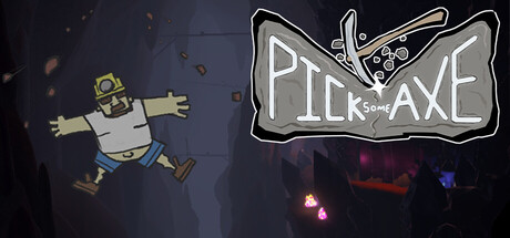
Explore a sprawling cave system to rescue your husband in Pick Some Axe, a 3D platformer from Chopping Block Studios. Use your trusty pickaxe to defeat monsters and dig through the earth to save the one you love.

Free to PlayPositive(12)
AdventureAction-AdventurePlatformer
Chopping Block StudiosApr 30, 2026

Pick Some Axe scores 70/100 — better than 33% of Adventure capsules (n=7,922).

Positive (12 reviews) · Free to Play · Released Apr 30, 2026 · By Chopping Block Studios

Quick text summary

Pick Some Axe scored 70/100 on Steam Analyzer — Good for a Adventure capsule. Top priority fix: [composition] Integrate lower cave environment elements closer to the character or title to create stronger visual unity and foreground-to-background layering.

Capsule scores by dimension

  • Genre Clarity: 7/10 — Clear platformer with action cues. The pickaxe-wielding character and mining/cave visual language immediately signal a mining-based action platformer. At tiny size, the character silhouette and pickaxe tool are readable, though the specific 3D platformer genre is less explicit than combat-heavy action games. The neon "PICK SOME AXE" logo reinforces the tool-based identity over pure action heroics.
  • Title Readability: 8/10 — Strong neon logo excellent contrast. The white outlined neon-style "PICK SOME AXE" text pops cleanly against the dark background and maintains legibility across full, small, and tiny sizes due to the bold outline treatment and high value contrast. The geometric letter forms are distinctive and don't collapse at small scales. Minor consideration: the subtitle text below is too small to read at tiny size, but the main title carries full recognition weight.
  • Contrast & Color: 8/10 — High value separation and silhouette clarity. White outlined neon lettering and the character's pale/tan color palette separate decisively from the deep blue-black background. The title logo uses a clean border stroke that maintains edge definition even at tiny sizes. Character silhouette reads clearly against the darker cave environment, and the warm red/magenta particle glow in the lower right adds color accent without muddying the overall contrast hierarchy.
  • Uniqueness & Polish: 6/10 — Competent but familiar indie presentation. The neon logo treatment is well-executed and gives a modern indie feel, but the overall composition reads as a standard character-plus-environment setup seen in many indie platformers. The pickaxe character is a clear unique hook for the game concept, yet the capsule doesn't deeply communicate the rescue narrative or cave-digging mechanic beyond basic visual placement. Polish is solid in execution but the concept feels safe rather than memorable.
  • Brand Consistency: 6/10 — Coherent but not distinctly memorable. The neon logo and character design are consistent in style, using a cohesive retro-modern indie aesthetic with clean outlines and muted color palette. However, without reference to the five store screenshots, there are no immediately iconic brand signals—no signature character pose, color motif, or visual symbol that would feel unmistakable as 'Pick Some Axe' alone. The presentation is internally consistent but not uniquely identifiable.
  • Composition: 7/10 — Clear focal point with balanced layout. The character is positioned on the left third creating clear primary focus, while the logo anchors the upper right with good negative space separation. At small and tiny sizes, the character silhouette and title logo both remain distinct without competing. Safe margins are observed and the composition resists cropping problems; however, the lower environment detail (red glow, particles) feels somewhat disconnected from the main subject and could be tightened for stronger unity.

What works

  • Readable neon logo across all sizes. White outlined text maintains edge clarity and contrast from full to tiny sizes due to bold stroke treatment and high value separation from the background.
  • Clear character silhouette and identity. The pickaxe-wielding character reads as a distinctive protagonist and immediately communicates the mining/digging core mechanic.
  • Strong background contrast cohesion. Dark blue-black background provides consistent depth that doesn't compete with foreground elements, creating visual hierarchy throughout scaling.

What hurts the capsule

  • Generic indie platformer presentation. The capsule layout and styling follow familiar indie game visual conventions without a distinctive visual hook beyond the neon logo treatment.
  • Unreadable subtitle text at small sizes. Secondary text below the main logo becomes illegible at small and tiny sizes, potentially losing secondary messaging and context.
  • Disconnected environmental elements. The red particle glow and lower environment details feel compositionally separate from the character focus rather than creating unified depth.

Priority fixes

  1. [composition] Integrate lower cave environment elements closer to the character or title to create stronger visual unity and foreground-to-background layering.
  2. [uniqueness_polish] Add a distinctive color accent or iconic element (signature palette highlight, distinctive pose, or thematic symbol) that reinforces brand memory across future marketing.
  3. [title_readability] Remove or simplify subtitle text, or reposition it with larger contrast-boosted lettering to remain readable at small sizes without cluttering the logo.

Store copy priority fixes

  1. [hook_strength] Replace 'Explore a sprawling cave system' with an action verb: 'Swing your pickaxe to fight rock monsters and dig deeper into a sprawling cave system to rescue your husband in this 3D platformer.'
  2. [feature_communication] Replace 'x different environments' with a concrete number and one specific example: 'Take on bosses in 5 unique environments—from crystal caverns to magma chambers—each with their own quirks and aesthetics.'
  3. [uniqueness] Add one sentence explaining the pickaxe's dual purpose: 'Your pickaxe doubles as both weapon and key—bash enemies to clear paths, then dig through walls to unlock shortcuts and secrets.'
  4. [tone_match] Remove 'That's not all, though!' and 'Mine, dig, and mine some more!' in favor of a consistent voice—either earnest adventure or playful—maintained throughout both story and mechanics sections.

Related guides

Steam app ID: 4459260 · Tags: Adventure, Action-Adventure, Platformer, 3D Platformer, Puzzle Platformer