Scoring genre clarity...

Tempest Bastion capsule

Tempest Bastion

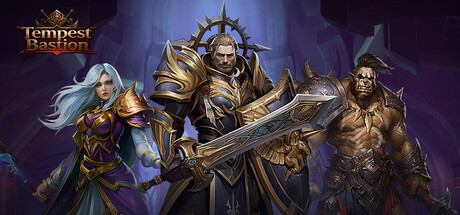
The chaotic 'Eclipse' awakens, corrupting the mythic land! In this epic fantasy Idle RPG, become the Guardian and unite tribal heroes. Zero grind! Claim massive AFK rewards, strategize your ultimate team, and vanquish the darkness to restore glory!

Free to PlayMixed(22)
Early AccessIdlerRPG
部落征服Apr 14, 2026

Tempest Bastion scores 75/100 — better than 68% of Early Access capsules (n=3,067).

Mixed (22 reviews) · Free to Play · Released Apr 14, 2026 · By 部落征服

Quick text summary

Tempest Bastion scored 75/100 on Steam Analyzer — Good for a Early Access capsule. Top priority fix: [genre_clarity] Add visual idle/AFK mechanic indicator such as passive damage symbols, floating coins, or glowing essence elements near heroes to differentiate from traditional RPG and communicate the game's unique idle positioning

Capsule scores by dimension

  • Genre Clarity: 8/10 — Clear fantasy RPG with team mechanics. The capsule immediately signals fantasy RPG through multiple distinct hero characters in ornate armor and magical attire arranged in a power pose formation. At TINY size, the silhouettes of varied character types (mage, warrior, rogue archetypes) and golden/blue color palette remain readable and convey tactical team-based gameplay. The composition directly supports the 'unite tribal heroes' and team strategy messaging from the description.
  • Title Readability: 7/10 — Logo readable at full and small sizes. The 'Tempest Bastion' logo in the top-left uses a warm gold/bronze color with serif letterforms and decorative crown icon that remains legible at SMALL size due to solid contrast against the dark purple background. At TINY size the logo becomes compressed but the icon and general wordmark shape remain recognizable, though fine letterform details blur. The placement in a cleared corner avoids competition with character silhouettes.
  • Contrast & Color: 8/10 — Strong value separation with warm accents. The golden armor and warm-toned heroes create clear visual separation against the cool deep purple/blue gradient background, with bright highlights on weapon details and character faces. In grayscale, the mid-tone characters still read distinctly from the dark background, and the reflected light on armor provides silhouette clarity at SMALL and TINY sizes. The color palette avoids mud and maintains saturation control across the ensemble.
  • Uniqueness & Polish: 7/10 — Polished fantasy art with premium rendering. The capsule demonstrates high-quality 3D character rendering with detailed armor textures, intentional lighting design, and a cohesive magical fantasy aesthetic that feels professional and premium. The arrangement communicates team synergy and individual character distinction rather than generic mook placement, and the lighting effects on armor suggest production value. However, the composition still reads as a standard hero roster lineup common in many fantasy RPGs, lacking a truly distinctive mechanical or narrative hook that would push it to 8+.
  • Brand Consistency: 7/10 — Consistent fantasy aesthetic and color identity. The warm gold/bronze and cool purple color scheme, combined with the ornate armor aesthetic and character diversity, establishes a coherent visual identity that could be recognized across marketing materials. The logo icon (crown/star motif) provides a memorable symbol, and the lighting approach is consistent across all character models. The internal art direction feels unified, though without reference to other store assets it is difficult to confirm whether this palette and style will feel iconic versus familiar for the game's overall brand.
  • Composition: 8/10 — Clear focal hierarchy with balanced ensemble. The large central warrior in golden armor commands primary attention, with the mage and rogue positioned on either side at slightly reduced scale, creating a natural eye-flow hierarchy that works at all sizes. The character group is well-centered with breathing room to edges, avoiding unsafe crop zones, and the vertical staging (varying character heights) adds depth. At TINY size the composition remains readable as a unit, though individual character details merge into a cohesive silhouette.

What works

  • Strong genre communication. Multiple distinct hero archetypes in tactical formation immediately signal fantasy RPG with team mechanics, supporting the core game loop promise.
  • Excellent contrast and readability. Gold armor and warm highlights pop clearly against the cool purple background, maintaining clarity through SMALL and TINY viewing with minimal detail loss.
  • Premium rendering and polish. High-quality 3D character models with detailed armor textures and intentional lighting create a production-value signal that justifies the game's mid-core positioning.
  • Safe composition with good margins. Central subject placement with balanced spacing to edges ensures no important elements risk Steam cropping or composition collapse at smaller sizes.

What hurts the capsule

  • Generic hero roster presentation. While well-executed, the standing hero lineup arrangement is a familiar trope in fantasy RPG marketing that doesn't communicate a unique selling point or core mechanic like 'AFK rewards' or 'zero grind'.
  • Tagline or subtext not visible. The description emphasizes 'Idle RPG' and 'AFK rewards' as differentiators, but these gameplay hooks are not visually communicated in the capsule at any size.
  • Limited color palette scope. Reliance on gold/bronze and purple, while cohesive, doesn't introduce secondary accent colors or visual elements that could strengthen memorability against similar fantasy RPG capsules.

Priority fixes

  1. [genre_clarity] Add visual idle/AFK mechanic indicator such as passive damage symbols, floating coins, or glowing essence elements near heroes to differentiate from traditional RPG and communicate the game's unique idle positioning
  2. [uniqueness_polish] Introduce secondary accent color or distinctive visual motif (tribal symbols, eclipse imagery, corrupted elements) that directly references 'Eclipse' and 'Eclipse Corrupts' to create narrative hook and brand distinctiveness
  3. [composition] Consider adding subtle environmental or mystical background details (corrupted landscape, eclipse symbol, magical aura) that frame the heroes and add storytelling depth without cluttering the hero focal point

Store copy priority fixes

  1. [hook_strength] Rewrite the opening of the detailed description to lead with the core idle mechanic rather than lore—e.g., 'Build your team while you sleep. Your heroes explore, battle, and gather rewards automatically while you're AFK. Earn rare gear and legendary companions without grinding.'
  2. [feature_communication] Add a single sentence clarifying the relationship between idle progression and active PvP—e.g., 'Idle progression builds your team strength; arena battles test your strategy in real-time against players worldwide.'
  3. [uniqueness] Replace 'This isn't just another mindless numbers game' with a specific differentiator—e.g., 'The dynamic random events system means your squad's AFK adventures generate unique story moments and tactical challenges unique to your playthrough.'
  4. [tone_match] Remove or repurpose the gift code section and customer service email; move them to the bottom or a support section, and rewrite the opening in consistent casual-engaging tone that matches the feature sections, not high fantasy prose.

Related guides

Steam app ID: 4459750 · Tags: Early Access, Idler, RPG, Creature Collector, Incremental