Golem Rumble scores 72/100 — better than 42% of Early Access capsules (n=3,067).

Quick text summary

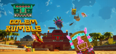
Golem Rumble scored 72/100 on Steam Analyzer — Good for a Early Access capsule. Top priority fix: [brand_consistency] Introduce a signature visual motif—such as a distinctive mask symbol or iconic golem character—that appears consistently in promotional materials to improve long-term brand recall.

Capsule scores by dimension

  • Genre Clarity: 7/10 — Action game with magical summoning clear. The capsule effectively communicates an action-arcade game through bright neon UI, colorful minion golems, and an arena-like setting with multiple characters. At TINY size, the silhouettes of distinct golems and the vibrant neon accents remain recognizable, though the specific 'summoning/shaman' mechanic is less explicit. The visual language reads as casual action-strategy rather than pure action, which aligns with the genre mix.
  • Title Readability: 8/10 — Bold yellow text strong at all sizes. GOLEM RUMBLE uses a large, bold yellow serif font with a dark green banner background positioned in the upper-middle area, ensuring excellent contrast and legibility at FULL, SMALL, and TINY sizes. The text remains readable even under squint and maintains clear letterforms without decorative collapse. Placement on a controlled banner rather than noisy background is a strong choice.
  • Contrast & Color: 8/10 — Vibrant saturation pops against dark sky. The golden yellow title, bright pink/magenta neon rings, red brick arena, and warm sandy ground create strong value separation against the blue sky background. At TINY size, the neon accents and yellow text remain distinctly visible and do not blend into the background. The warm-to-cool color harmony and saturated hues ensure quick visual pop during Steam scroll.
  • Uniqueness & Polish: 7/10 — Distinctive art style, minor generic elements. The chunky voxel-like golem aesthetic, neon UI overlays, and playful arena setting communicate a unique indie game identity with intentional stylization. However, the scene composition (central arena with multiple characters) is a familiar action game trope, and the overall presentation, while polished, does not have a singular standout hook that would distinguish it from other colorful indie brawlers at a glance. The craft is solid but not exceptional.
  • Brand Consistency: 6/10 — Coherent art direction, limited iconic elements. The capsule uses a consistent voxel-inspired art style, warm color palette, and neon UI language that likely carries through the 9 store screenshots referenced. However, there is no single iconic character, symbol, or signature motif immediately recognizable as 'Golem Rumble'—the golems are colorful but not distinctly branded. The green banner with gold text provides some branding anchor, but more memorable identity cues would strengthen recall.
  • Composition: 7/10 — Clear focal point, balanced layout. The central arena stage with three distinct golems creates a clear focal point and guides the eye effectively at SMALL and TINY sizes. The title banner anchors the upper-middle without obscuring action, and layering (sky background, arena, golems, foreground items) provides good depth. The composition is well-balanced and resilient to Steam cropping, though the golems on the sides could risk minor edge clipping depending on viewport.

What works

  • Excellent title contrast and legibility. Bold yellow serif text on dark green banner reads perfectly at TINY size and maintains strong visual hierarchy across all viewing scales.
  • Vibrant color palette with quick pop. Neon pinks, warm golds, and saturated reds create immediate visual interest and stand out distinctly against Steam's dark background during quick scroll.
  • Clear arena setting communicates action gameplay. The staged, arena-like environment with multiple colorful golems immediately suggests multiplayer combat and action-strategy gameplay without ambiguity.
  • Coherent voxel art style throughout. The chunky, blocky aesthetic is consistently applied to all elements, reinforcing a unified indie game identity.

What hurts the capsule

  • Limited iconic brand symbol. While the art is cohesive, there is no single standout character, mask, or motif that would make the game immediately recognizable on a second viewing.
  • Generic multiplayer arena trope. The central staged arena with opposing minions is a familiar visual pattern that does not strongly differentiate this title from other casual action games.
  • Golem silhouettes lack distinctiveness. The three golems, while colorful, are relatively simple shapes that do not communicate unique personality or gameplay mechanics at small sizes.

Priority fixes

  1. [brand_consistency] Introduce a signature visual motif—such as a distinctive mask symbol or iconic golem character—that appears consistently in promotional materials to improve long-term brand recall.
  2. [uniqueness_polish] Add a subtle gameplay hint or unique environmental detail (e.g., magical particle effect, special arena prop) that differentiates this from generic arena brawlers.
  3. [composition] Review edge safety margins to ensure side golems and decorative items do not get cropped by Steam viewport variations at SMALL sizes.

Store copy priority fixes

  1. [feature_communication] Add 1-2 sentences to the mask/golem section explaining how many masks exist, whether they synergize, or give a concrete example (e.g., 'a fire golem and ice golem combo freezes enemies'). This answers 'how deep is the strategy?'
  2. [uniqueness] Insert a sentence contrasting this game's hybrid model: 'Unlike pure summoning games, you directly influence every fight. Unlike solo action games, your summons amplify your power.' This makes the differentiation explicit.
  3. [feature_communication] Expand the progression sentence to specify: are unlocks cosmetic (skins, emotes), mechanical (new masks), or both? Early Access players need to understand what content depth exists at launch.

Related guides

Steam app ID: 4461610 · Tags: Early Access, Action, Multiplayer, Casual, PvP