Scoring genre clarity...
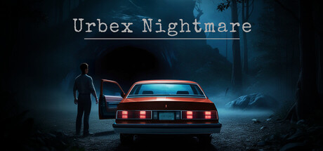
A short atmospheric horror experience inspired by urban exploration. Explore a cursed abandoned location, gather a few clues, and escape while something stalks you. Playtime: 20–30 minutes. Focus on exploration and atmosphere. Playtime: 20–30 minutes Developed by a solo developer (first project)
$2.008 user reviews
1980sSurvival HorrorHorror
Dominique GervaisMar 30, 2026