Scoring genre clarity...
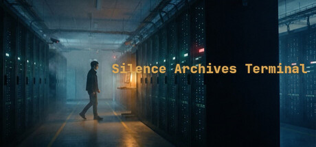
Hack into a classified archive of 120 intercepted documents. In this retro terminal investigation, every file you read alters reality — your observations are irreversible, the Federation is watching, and three divergent endings await based on how deep you dare to dig.
$2.99
AdventureSimulationCasual
R.C. ZhangMar 13, 2026