Scoring genre clarity...
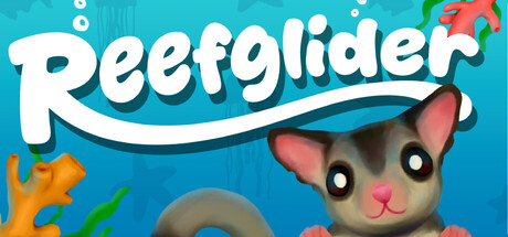
You're a sugar glider under the ocean! Run, jump and glide through the great barrier reef as you acquire aquatic allies to cure coral colonies. Friendly fish join you on your journey allowing you to jump higher and access more areas in the environment!
$3.998 user reviews
3D PlatformerPlatformerAction
Down UnderwaterMar 17, 2026