Scoring genre clarity...

Okay, Panic capsule

Okay, Panic

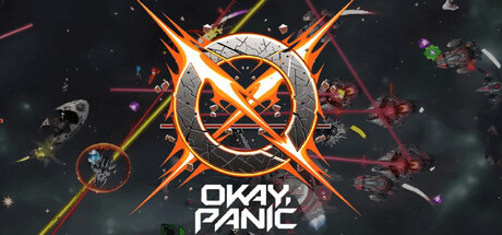
A top-down space survival roguelite. Harvest crystallized spacetime, build your arsenal from 40+ absurdly named weapons, and hold off increasingly hostile void entities until the universe runs out of things to throw at you. It usually doesn't.

$10.49
Action RoguelikeBullet HellTop-Down Shooter
GotANormalJobMar 17, 2026

Okay, Panic scores 75/100 — better than 68% of Action Roguelike capsules (n=1,675).

$10.49 · Released Mar 17, 2026 · By GotANormalJob

Quick text summary

Okay, Panic scored 75/100 on Steam Analyzer — Good for a Action Roguelike capsule. Top priority fix: [genre_clarity] Add a subtle gameplay element like a stylized weapon silhouette or harvested crystal visual to hint at the roguelite progression mechanic and set it apart from generic space combat.

Capsule scores by dimension

  • Genre Clarity: 8/10 — Space action roguelite clear. The top-down perspective, orbiting asteroids, crystalline space debris, and glowing orange X-mark reticle immediately signal action-based space survival gameplay. At tiny size, the asteroid field and central targeting crosshair remain recognizable as a space combat game, though the specific roguelite mechanic is less obvious from visuals alone.
  • Title Readability: 8/10 — Bold title readable all sizes. The title 'OKAY, PANIC' in clean white sans-serif sits centered at the bottom with strong contrast against the dark background and does not collapse at small or tiny sizes. The letterforms maintain clarity and the layout avoids cluttering the focal point, though the tagline-like title placement leaves minimal breathing room at the smallest viewport.
  • Contrast & Color: 8/10 — Orange glow pops effectively. The bright orange X-mark and beam effects create strong value separation against the dark space background and stand out immediately in quick scroll. The glowing edges and warm orange tones contrast well in grayscale and maintain silhouette clarity at all sizes, though some of the smaller asteroid particle detail softens at tiny scale.
  • Uniqueness & Polish: 7/10 — Distinctive space action branding. The glowing X-reticle and crystalline asteroid aesthetic feel intentional and visually cohesive rather than generic, with clean particle effects and deliberate color grading that suggests polish. The title 'OKAY, PANIC' conveys quirky indie personality, though the overall composition remains somewhat familiar within space action covers and does not reveal the unique 40+ weapon absurdity hook.
  • Brand Consistency: 7/10 — Coherent space aesthetic identity. The warm orange glow, crystalline debris field, and dark void establish a recognizable internal visual language that appears consistent with indie space action branding. The glowing X-mark and particle effects create a distinctive motif that could be recognized across marketing materials, though without reference to the other 9 screenshots, deeper identity cues remain unverified.
  • Composition: 7/10 — Focused center with layered depth. The glowing X-reticle anchors the center as the primary focal point, with asteroids and particle debris layered around it to create depth and guide the eye inward. The title placement at the bottom works well at small size and the composition avoids dead space, though at full size the surrounding particle field can feel slightly scattered and the tight edges risk minor cropping issues on some Steam viewport dimensions.

What works

  • Orange glow cuts through dark background. The warm orange X-mark and beam effects provide excellent contrast against the #1b2838 Steam dark background and remain visually dominant at all sizes.
  • Title remains legible at tiny size. The centered white sans-serif 'OKAY, PANIC' maintains clarity and does not collapse or blur when viewed as a small thumbnail due to strong contrast and clean letterforms.
  • Clear space combat genre messaging. The asteroid field, orbiting debris, targeting reticle, and void setting immediately communicate action-based space gameplay to a quick-scrolling viewer.
  • Cohesive visual language. The glowing particles, crystalline aesthetic, and consistent warm-cold color palette feel intentional and unified across the entire composition.

What hurts the capsule

  • Particle field loses definition at tiny size. The smaller asteroid and debris particles blur together at thumbnail scale, reducing visual clarity and making the secondary elements harder to parse.
  • Generic space action cover trope. While well-executed, the glowing reticle and asteroid debris composition overlaps with familiar space action branding and does not visually hint at the game's unique roguelite or absurdist weapon mechanic.
  • Limited gameplay hook communication. The cover does not convey the core selling points of 40+ absurdly named weapons, crystallized spacetime harvesting, or escalating void entity encounters that differentiate it from other space action games.

Priority fixes

  1. [genre_clarity] Add a subtle gameplay element like a stylized weapon silhouette or harvested crystal visual to hint at the roguelite progression mechanic and set it apart from generic space combat.
  2. [uniqueness_polish] Emphasize the absurdist tone through visual gags or exaggerated weapon designs in the particle field to communicate the game's quirky personality and hook players on its unique identity.
  3. [composition] Simplify the mid-scale asteroid particle density to maintain visual clarity at small and tiny sizes while preserving the depth effect at full resolution.

Store copy priority fixes

  1. [feature_communication] Add one sentence explaining the weapon upgrade/synergy system after the sentence about 40+ weapons. Example: 'Each weapon can be modified with synergistic upgrades—stacking fire rate and chain reactions creates exponentially more powerful builds.' This directly addresses the 'build customization' promise.
  2. [genre_clarity] After describing the boss encounter, add a sentence explaining how it differs from wave survival and what decision-making is required. Example: 'Bosses demand pattern recognition and sustained focus—your combo meter and resource management become critical as the arena compresses around you.'
  3. [audience_targeting] Add a dedicated sentence in the short description or opening paragraph acknowledging accessibility features explicitly. Example: 'Playable with keyboard only, without timed input, and with custom volume controls—highly accessible while maintaining deep mechanical depth.'
  4. [uniqueness] Strengthen the differentiation by explicitly naming what is rare or novel. Example: 'Unlike most roguelikes, Mefisto's emotional state and judgment system react specifically to your playstyle, creating a unique meta-commentary on your own performance.' This makes the AI companion feel truly distinct rather than gimmicky.

Related guides

Steam app ID: 4466920 · Tags: Action Roguelike, Bullet Hell, Top-Down Shooter, Roguelite, Action