Escape from Vacov scores 60/100 — better than 0% of Casual capsules (n=10,153).

Quick text summary

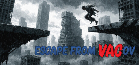
Escape from Vacov scored 60/100 on Steam Analyzer — Solid for a Casual capsule. Top priority fix: [title_readability] Thicken title outline or increase letter spacing to maintain 'VACOV' legibility at TINY size (120x45); test readability in actual Steam thumbnail scale.

Capsule scores by dimension

  • Genre Clarity: 7/10 — Platformer action clear, urban setting strong. The silhouette of a character mid-jump across broken platforms against a dystopian cityscape clearly signals platformer action. The crumbling architecture and falling figure communicate obstacle-based gameplay and environmental hazard mechanics at full size. At TINY size, the character jump and fragmented platforms remain visible but context is lost; the dystopian threat feels generic rather than uniquely Vacov-specific.
  • Title Readability: 6/10 — Title readable full size, falters tiny. The title 'ESCAPE FROM VACOV' uses solid blue and red text with clean sans-serif letterforms that read clearly at full and SMALL sizes. At TINY size (120x45), the text shrinks significantly and loses impact, particularly the red 'VACOV' portion which compresses into a blur against the gray sky. The outline and spacing are adequate at full resolution but the small tagline or game description is not visible, limiting immediate game type recognition at thumbnail scale.
  • Contrast & Color: 7/10 — Good value separation, sky blends midtones. The black silhouette of the character and dark platform edges create strong contrast against the light gray overcast sky, reading clearly at all sizes. The blue and red title text also separates well from the background at SMALL and TINY sizes. However, the overall palette is dominated by cool grays and blacks with limited saturation; at TINY size the grayscale test shows the mid-tone sky absorbs some definition in the character's posture and platform structure.
  • Uniqueness & Polish: 5/10 — Competent but familiar dystopian platformer aesthetic. The composition—character leaping across fragmented platforms in a crumbling cityscape—is a well-executed visual metaphor but echoes common indie platformer tropes (see Dredge, Lethal Company visual language). The rain, dramatic sky, and urban decay are polished and atmospheric but not visually distinctive enough to stand out from the genre's established visual vocabulary. The concept of 'the system watches you' is communicated conceptually rather than through unique visual design cues like a distinctive art style or iconic symbol.
  • Brand Consistency: 5/10 — Cohesive but generic dystopian identity. The rendering style is internally consistent—monochromatic character, realistic architecture, cinematic lighting—and the dystopian palette is well-maintained across the visible frame. However, there are no iconic character traits, signature motifs, or distinctive brand signals (logo, color scheme, recurring symbol) that would make Vacov visually memorable on repeat exposure. Without reference to the other five store screenshots, this capsule does not establish a recognizable visual identity specific to Vacov versus any other dystopian platformer.
  • Composition: 6/10 — Clear focal point, minor balance concerns. The jumping figure in mid-air is the strong focal point, and the fragmented platforms naturally guide the eye along the action line from left to right, creating clear hierarchy at SMALL and TINY sizes. The title placement at the bottom center does not interfere with the main action. However, the composition feels slightly bottom-heavy; the majority of visual weight sits in the lower half, leaving the bright sky as an underutilized upper region that reads as empty space rather than enhancing atmosphere.

What works

  • Strong silhouette contrast. The black character and platform edges read clearly against the light gray sky at all viewing scales, including TINY.
  • Clear focal point and action clarity. The mid-jump character creates immediate visual interest and communicates platformer gameplay without ambiguity.
  • Readable title at standard sizes. The blue and red text treatment is legible at FULL and SMALL sizes with adequate color separation from background.

What hurts the capsule

  • Title legibility collapses at TINY. Red 'VACOV' text compresses into an unreadable blur at 120x45 scale, reducing game name recognition at thumbnail.
  • Generic visual language for indie platformers. Dystopian cityscape and character silhouette are competent but not distinctive; the capsule does not communicate what makes Vacov unique versus similar games.
  • No memorable brand identity signals. The capsule lacks iconic character design, signature palette, or motif that would create visual recall or recognition.
  • Underutilized upper composition space. The bright sky in the upper half feels empty and atmospheric rather than actively supporting visual hierarchy or gameplay hint.

Priority fixes

  1. [title_readability] Thicken title outline or increase letter spacing to maintain 'VACOV' legibility at TINY size (120x45); test readability in actual Steam thumbnail scale.
  2. [uniqueness_polish] Add a distinctive visual signature—an iconic symbol, color accent, or character trait (e.g., a glowing eye, unique silhouette detail, or branded UI element) that signals Vacov's unique 'system watches you' mechanic.
  3. [composition] Rebalance the frame to engage the upper sky region with atmospheric or mechanical detail (e.g., surveillance camera, system overlay, falling rain pattern) that hints at the game's core threat.
  4. [brand_consistency] Introduce a consistent secondary color or accent (warm orange, neon pulse, or monitoring UI glow) that can serve as a recognizable Vacov signature across all marketing materials.

Store copy priority fixes

  1. [feature_communication] Expand the detailed description to explain what 'the system adapts' means concretely—do platforms disappear on a timer, after player actions, or based on level progression? Give 1-2 concrete examples of traps or mechanics.
  2. [audience_targeting] Clarify whether this game is casual or hardcore by either softening the ban/surveillance language for younger players or explicitly marketing it to precision platformer veterans and speedrunners only.
  3. [uniqueness] Replace 'Perfect for speedrunners' with a specific differentiator: 'the only platformer where [X mechanic unique to Vacov]' or explain what adaptive difficulty does that similar games don't.

Related guides

Steam app ID: 4467410 · Tags: Casual, Arcade, Platformer, 2D Platformer, Precision Platformer