Scoring genre clarity...
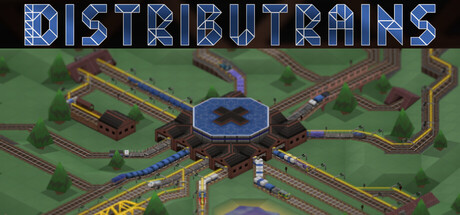
A railroad simulation game with roguelike elements. Use resources wisely to expand your infrastructure and satisfy industries, contracts, citizens, and engines. Respond quickly to ever-changing circumstances and don't get kicked out of your office.
$11.99Positive(23)
SimulationStrategyTrains
OddwargMar 30, 2026