Scoring genre clarity...

Dama e Dungeons: 2D capsule

Dama e Dungeons: 2D

Manage a team of heroes on an epic journey, make tough choices and face the consequences, show all your knowledge and creativity to create incredible strategies and item combinations to achieve victory.

$15.99
CasualStrategyRPG
José Leonardo Silva GuerreiroApr 1, 2026

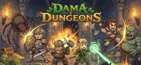
Dama e Dungeons: 2D scores 77/100 — better than 75% of Casual capsules (n=10,153).

$15.99 · Released Apr 1, 2026 · By José Leonardo Silva Guerreiro

Quick text summary

Dama e Dungeons: 2D scored 77/100 on Steam Analyzer — Good for a Casual capsule. Top priority fix: [genre_clarity] Consider adding a subtle iconic logo or sigil (e.g., a stylized dungeon door or team crest) to enhance brand recognition and make the game feel more distinctive in the indie RPG market.

Capsule scores by dimension

  • Genre Clarity: 8/10 — Clear casual RPG dungeon adventure. The capsule immediately communicates a dungeon-crawling RPG through iconic visual elements: a party of four distinct heroes in fantasy gear, glowing magical effects (green orb, fire), dungeon architecture with stone pillars and hanging lanterns, and a goblin enemy. At tiny size, the silhouettes of the party and central magic glow remain readable, and the dungeon setting is unmistakable, though individual character details blur slightly.
  • Title Readability: 8/10 — Strong readable dual-line title. The title 'DAMA DUNGEONS' uses bold uppercase text with a green-and-gold color split that contrasts well against the dark dungeon background. At small size the text remains clearly legible with good letter spacing and no overlap with character silhouettes. At tiny size, the letters hold up reasonably well though some fine details in serifs soften, but the overall word shape remains recognizable.
  • Contrast & Color: 8/10 — Vibrant warm tones pop against dark. The capsule leverages warm oranges and golds from the lanterns and fire effects, plus bright greens from the magic orb and title, all set against a cool dark stone background. The value separation is strong—bright highlights on characters and effects create clear silhouettes even at small sizes. In grayscale, the light magic and character outlines maintain good separation from the dark dungeon interior.
  • Uniqueness & Polish: 7/10 — Polished illustrated style, slight genericism. The art style is clean, colorful, and well-executed with consistent hand-drawn character poses and coherent lighting. The composition and character variety suggest intentional visual storytelling. However, the scene relies on familiar dungeon-party archetypes without a distinctive hook that sets it apart from other indie RPGs—it is premium-looking but not visually unique enough to stand out in a crowded indie genre space.
  • Brand Consistency: 7/10 — Cohesive art direction, limited icon. The capsule maintains internal consistency with matching art style across all hero and enemy designs, unified warm-gold and green color palette, and coherent dungeon aesthetic. The visual identity is solidly built, though there is no single iconic character or signature motif visible that would immediately distinguish this game's brand in isolation from other fantasy RPGs on the store.
  • Composition: 8/10 — Well-balanced party focal point. The four-hero party forms a natural central focal point with the bright magical effects (fire, green orb) drawing the eye, while background dungeon elements (pillars, lanterns, goblin) frame and support without competing. At small and tiny sizes, this hierarchy holds—the party cluster remains the clear primary subject. The layout uses depth effectively with foreground characters, midground magic, and background architecture, with safe margins that resist Steam cropping.

What works

  • Strong color palette and contrast. Warm golds, bright greens, and orange fire effects create excellent visual pop against the dark stone background and remain readable at all sizes.
  • Clear party-based visual storytelling. Four distinct heroes with varied silhouettes and poses immediately communicate team-based gameplay and character diversity.
  • Legible title placement and design. The green-and-gold title sits in a controlled upper area with excellent contrast and letter spacing that holds up at small and tiny sizes.
  • Coherent dungeon setting and depth. Layered composition with clear foreground (party), midground (magic effects), and background (architecture) creates visual hierarchy and atmosphere.

What hurts the capsule

  • Generic fantasy dungeon archetype. While well-executed, the scene relies on familiar party-in-dungeon tropes without a distinctive visual hook or unique mechanic implied by the design.
  • Limited brand identity iconography. No single memorable character, logo mark, or signature visual motif is present to create lasting brand recall or differentiation.
  • Fine detail loss at tiny size. Character equipment details, facial features, and some background dungeon elements blur significantly at the smallest viewing sizes, reducing visual impact.

Priority fixes

  1. [genre_clarity] Consider adding a subtle iconic logo or sigil (e.g., a stylized dungeon door or team crest) to enhance brand recognition and make the game feel more distinctive in the indie RPG market.
  2. [uniqueness_polish] Incorporate a visual hint of a core mechanic (e.g., a choice-branching symbol or strategy grid) to elevate the capsule beyond generic dungeon-party imagery.
  3. [title_readability] Test the green-and-gold title at 45px height to confirm letter recognition holds; if not, consider a subtle thin outline or stronger saturation boost to the gold.

Store copy priority fixes

  1. [hook_strength] Replace 'epic journey' and 'incredible strategies' in the short description with a concrete gameplay outcome: 'Manage a team of heroes on a roguelike journey inspired by checkers—every move and choice determines if your party survives or falls.'
  2. [uniqueness] Add one sentence to the Tactical Combat section that explicitly contrasts this mechanic to traditional tactical RPGs: 'Unlike grid-based tactics, checkers-inspired movement forces lateral thinking about positioning and capture chains.'
  3. [audience_targeting] Insert a sentence after the opening that clarifies the primary audience: 'Perfect for strategy fans who enjoy turn-based roguelikes with meaningful choices and high replayability—no real-time pressure required.'

Related guides

Steam app ID: 4482730 · Tags: Casual, Strategy, RPG, Point & Click, Turn-Based Strategy