Scoring genre clarity...

Overcooked capsule

Overcooked

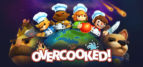
Overcooked is a chaotic couch co-op cooking game for one to four players. Working as a team, you and your fellow chefs must prepare, cook and serve up a variety of tasty orders before the baying customers storm out in a huff.

$1.69Very Positive(119)
Local Co-OpMultiplayerCooking
Ghost Town Games Ltd.Aug 3, 2016

Overcooked scores 83/100 — better than 91% of Local Co-Op capsules (n=610).

Very Positive (119 reviews) · $1.69 · Released Aug 3, 2016 · By Ghost Town Games Ltd.

Quick text summary

Overcooked scored 83/100 on Steam Analyzer — Good for a Local Co-Op capsule. Top priority fix: [composition] Reduce the visual weight of the lower-corner foreground bear and dog busts or pull them inward so they do not get cropped at tiny size and add to dark clutter.

Capsule scores by dimension

  • Genre Clarity: 9/10 — Cooking co-op chaos instantly readable. Four chef-hatted cartoon characters atop a globe with cooking tools, food items, and fire immediately communicate a cooking game with multiplayer chaos. The globe setting suggests a world-spanning adventure element while the chef hats, frying pan, knife, and tomato are unambiguous genre cues. Even at tiny size the chef hats and colorful food-related silhouettes read as a cooking game.
  • Title Readability: 9/10 — Bold white logo reads at all sizes. The OVERCOOKED! title uses a thick, rounded white font with a strong red outline and drop shadow, placed against a relatively clean lower-center region of the globe. At small and tiny sizes the bold letterforms and high contrast outline keep the title legible even as the supporting characters compress. The exclamation mark reinforces the energetic tone and remains visible at small size.
  • Contrast & Color: 8/10 — Vibrant palette pops on dark Steam background. The warm purple-to-deep-space gradient background provides natural separation from Steam's #1b2838 dark background, while the bright green globe, orange fireballs, and white chef hats create strong value contrast. In grayscale the characters and globe read clearly against the dark background with good silhouette separation. The large brown bear character in the foreground corners slightly competes with the background in darker tones but does not critically harm readability.
  • Uniqueness & Polish: 8/10 — Charming cartoon craft, genre-distinctive hook. The cartoony chibi style, globe composition with multiple character types including a cat, a bear king, and a dog, and the chaotic scattering of food items create a distinctive visual personality that stands apart from generic casual game covers. The polish level is high with clean linework, consistent lighting, and well-executed character variety. Compared to the benchmark genre capsules it holds its own through sheer personality, though it lacks the iconic singular focus of top-tier capsules like Balatro or DAVE THE DIVER.
  • Brand Consistency: 8/10 — Cohesive cartoon identity with strong motifs. The rounded chibi character style, chef hat motif, globe, and chaotic food scatter form a recognizable internal identity that aligns tightly with the couch co-op cooking game brand. The warm orange fireballs and deep purple cosmic backdrop create a signature palette that would be recognizable across multiple assets. The bold white-with-red-outline logo treatment is distinctive and memorable, reinforcing brand recognition.
  • Composition: 8/10 — Globe focal point with layered character ring. The globe acts as a strong central anchor with characters arranged in a rising arc above it, creating a natural hierarchy from the title text at bottom center to the characters in the midground to the fireballs in the upper right. The foreground bear and dog busts frame the sides and add depth layering. At tiny size the composition compresses well and the chef hat cluster remains the dominant visual signal, though the side bear faces become cropped and lose context.

What works

  • Instant genre recognition. Chef hats, cooking tools, and food items communicate a cooking game within a single glance even at tiny thumbnail size.
  • High-contrast bold title treatment. The thick white OVERCOOKED! logo with red outline sits on a clean background region and remains legible down to the smallest Steam display sizes.
  • Strong character personality and variety. Four distinct chef characters plus bear and dog framing figures create a rich co-op cast impression that communicates multiplayer chaos effectively.
  • Vibrant palette separates from Steam dark UI. The purple cosmic gradient and bright globe naturally contrast with Steam's #1b2838 background, ensuring the capsule stands out in scroll.

What hurts the capsule

  • Foreground bear characters lose context at tiny size. The large brown bear king and dog in the lower corners get heavily cropped at tiny thumbnail size, becoming ambiguous dark shapes that slightly muddy the clean read.
  • Busy scatter of food items adds visual noise. The fried egg, pan, water splash, and other scattered food props around the globe add charm at full size but create clutter that competes with the title at small size.
  • Upper right fireball area pulls attention from focal point. The orange meteors in the upper right corner create a secondary hot zone that competes with the character arc for eye priority on quick scroll.
  • Generic globe composition familiar in casual games. The four characters standing on a globe is a repeated convention in casual and party games, reducing distinctiveness versus bolder compositional choices.

Priority fixes

  1. [composition] Reduce the visual weight of the lower-corner foreground bear and dog busts or pull them inward so they do not get cropped at tiny size and add to dark clutter.
  2. [contrast_color] Tone down or simplify the scattered food prop elements around the globe to reduce mid-composition noise and let the character cluster and title breathe.
  3. [genre_clarity] Consider pushing one hero character slightly larger and more central above the globe to create a single dominant focal point that survives tiny thumbnail compression.
  4. [uniqueness_polish] Introduce a more distinctive compositional angle or unique visual hook beyond the globe convention to differentiate from other casual co-op capsules in the genre.

Store copy priority fixes

  1. [feature_communication] Add one concrete sentence explaining what kitchen stations or cooking mechanics players interact with—e.g., 'chop ingredients, manage burners, plate dishes, and adapt to dynamic kitchen hazards' to ground the gameplay loop in specific actions.
  2. [uniqueness] Replace or supplement generic 'chaotic kitchens' language with a sentence explicitly comparing this to competitor titles or highlighting what co-op mechanic is novel—e.g., 'asymmetric kitchen layouts require constant communication' or 'real-time ingredient management unlike turn-based cooking games'.
  3. [feature_communication] Expand the competitive modes sentence to clarify win conditions and how competitive differs from co-op—e.g., 'compete head-to-head by fulfilling orders faster or with higher accuracy' to set correct player expectations.

Related guides

Steam app ID: 448510 · Tags: Local Co-Op, Multiplayer, Cooking, Indie, Arcade