Scoring genre clarity...
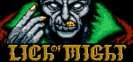
In this genre-defying action game you are the boss at the end of the dungeon. An undead lich. Each hero that invades your lair must be mercilessly destroyed using the necromantic power at your fingertips. You are the final test. Your dungeon, their demise.
$4.991 user reviews
ActionIndieTwin Stick Shooter
CandleblackApr 27, 2026