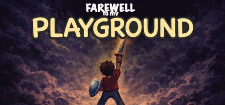
Farewell to my Playground scores 72/100 — better than 46% of Action capsules (n=8,534).

Quick text summary

Farewell to my Playground scored 72/100 on Steam Analyzer — Good for a Action capsule. Top priority fix: [uniqueness_polish] Incorporate subtle visual elements from the school setting (playground equipment, classroom objects) into the background to strengthen thematic specificity and differentiate from generic atmospheric templates.

Capsule scores by dimension

  • Genre Clarity: 7/10 — Action-adventure with emotional core. The silhouette of a child figure holding a shield against a dramatic sky clearly signals action gameplay, and the nostalgic school setting implied by the title creates genre cohesion. At tiny size, the pose and shield are readable enough to suggest combat-focused adventure, though the emotional 'farewell' element does not translate visually at that scale.
  • Title Readability: 8/10 — Strong hierarchy, clear at all sizes. The white uppercase 'FAREWELL' and large golden 'PLAYGROUND' stack with excellent contrast against the dark sky background. At tiny size, the primary title 'PLAYGROUND' remains clearly legible, and the smaller 'to my' acts as a readable supporting line without becoming illegible noise.
  • Contrast & Color: 8/10 — Warm glow pops cleanly against dark. The golden-orange light burst around the central figure and warm amber sky tones create strong value separation from the deep blue-purple cloud background and dark game background. At tiny size the silhouette and light halo remain distinct, and grayscale conversion shows clear light-dark separation without muddy mid tones.
  • Uniqueness & Polish: 7/10 — Atmospheric emotional hook, well-executed. The juxtaposition of childhood silhouette against dramatic apocalyptic skies creates a distinctive visual story that hints at the game's emotional farewell theme. The professional gradient work and lighting effect feel polished and intentional, though the overall concept of a lone figure against dramatic sky is somewhat familiar in indie game marketing.
  • Brand Consistency: 6/10 — Atmospheric but lacks visual signature. The warm golden palette and dramatic lighting are cohesive, and the child-with-shield icon could serve as a recognizable motif, but without access to the broader brand identity from other marketing materials, the capsule reads as thematically consistent rather than distinctly branded. The pixel-art claim in the description is not evident in this header, which appears to be painterly illustration.
  • Composition: 7/10 — Clear focal point, well-balanced layout. The child figure centered with upward-facing pose creates strong hierarchy and draws the eye naturally at all sizes. Title text is positioned in safe upper margins away from crop risk, and the layered depth (foreground figure, midground glow, background sky) provides visual structure that works at small and tiny sizes without clutter.

What works

  • Title contrast and hierarchy. White and golden text stack clearly against dark sky and remain highly legible at tiny thumbnail size without outline dependency.
  • Warm atmospheric lighting. The golden-amber glow around the figure creates strong silhouette separation and visual pop against the dark Steam background while reinforcing the game's emotional tone.
  • Clear focal point and composition. Centered character pose with upward gaze and shield guides viewer attention immediately and maintains strong hierarchy across all viewing sizes without scattered elements.

What hurts the capsule

  • Pixel-art claim not evident. The header uses painterly illustration style which conflicts with the game's described pixel-art aesthetic, creating potential brand inconsistency with actual gameplay visuals.
  • Generic atmospheric formula. The lone figure against dramatic sky composition is visually familiar in indie game marketing and does not immediately communicate the game's unique beat-'em-up mechanic or school-based nostalgia setting.
  • Limited brand identity signals. Without distinctive character design, color palette, or iconography cues, the capsule lacks memorable visual signature that would aid recognition in store browsing or franchise building.

Priority fixes

  1. [uniqueness_polish] Incorporate subtle visual elements from the school setting (playground equipment, classroom objects) into the background to strengthen thematic specificity and differentiate from generic atmospheric templates.
  2. [brand_consistency] Align header illustration style with actual pixel-art gameplay by either converting to pixel aesthetic or explicitly rebranding as painterly if that matches in-game visuals, ensuring cohesion across store pages.
  3. [genre_clarity] Add subtle combat or nostalgia visual cues (weapon design details, friends in background, memory fragments) to clarify the beat-'em-up and emotional journey elements beyond the shield silhouette.

Store copy priority fixes

  1. [feature_communication] Add 1–2 sentences explaining how the game's emotional themes (memory, farewell) mechanically influence gameplay—e.g., do combat encounters reflect character memories, does progression unlock emotional narrative beats, do player choices affect the ending—to bridge the gap between theme and action.
  2. [hook_strength] Rewrite the opening of the detailed description to lead with a specific action or moment—e.g., 'Relive your final day at school, fighting through waves of memory-haunted enemies to say goodbye to a place you love'—to make the emotional premise more visceral and immediate.
  3. [uniqueness] Add a sentence comparing or contrasting this game with similar titles—e.g., 'Unlike typical beat 'em ups, every enemy represents a fragment of your past, and combat is as much about confronting memory as defeating foes'—to clarify the signature difference.
  4. [feature_communication] Expand the combat description to include one sensory detail about how it feels to play—e.g., 'snappy, responsive controls,' 'screen-filling effects,' 'rhythm-based timing'—to give players a tactile sense of the action.

Related guides

Steam app ID: 4486250 · Tags: Action, Beat 'em up, Hack and Slash, Top-Down, Adventure