Scoring genre clarity...

Rogue Hex Mines capsule

Rogue Hex Mines

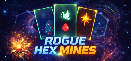
Hex Minesweeper meets Roguelike — on a fog-shrouded hexagonal board, use 16 tools like fireworks, black holes, and magnets to clear mines, collect rogue cards, to reveal more tiles and defeat 8 unique Bosses. Runs as a transparent overlay on your desktop. Pick up and play anytime.

$0.99
StrategyCasualRoguelite
rgyrgMar 27, 2026

Rogue Hex Mines scores 80/100 — better than 92% of Strategy capsules (n=5,103).

$0.99 · Released Mar 27, 2026 · By rgyrg

Quick text summary

Rogue Hex Mines scored 80/100 on Steam Analyzer — Good for a Strategy capsule. Top priority fix: [genre_clarity] Add a subtle roguelike progression cue such as a small boss silhouette or reward-card icon to clarify the roguelike hybrid mechanic alongside the puzzle aesthetic.

Capsule scores by dimension

  • Genre Clarity: 8/10 — Clear puzzle strategy gameplay. The hexagonal grid cards with neon-outlined suit symbols (leaf, droplet, star) immediately signal a puzzle or strategy card game. At TINY size, the bright neon frames and glowing elements still read as a tactical game board mechanic. The roguelike aspect is less obvious without context, but the puzzle-roguelike hybrid is suggested by the card-based visual language and tool icons.
  • Title Readability: 8/10 — Strong, legible two-part title. ROGUE HEX MINES uses clear sans-serif capitals with excellent contrast—cyan 'ROGUE HEX' and warm orange 'MINES' create color separation and visual rhythm. At SMALL size the title remains fully readable with no letterform collapse. The text sits on a dark background with glow effects that enhance legibility without muddying clarity.
  • Contrast & Color: 9/10 — Vibrant neon pop against dark. Bright cyan, lime green, and orange neon outlines on the card frames create exceptional value contrast against the dark blue-purple space background. The glowing particle effects and orange explosion burst in the bottom left add warm highlights that prevent the design from feeling cold. Even at TINY size, the neon silhouettes remain distinct and eye-catching on #1b2838.
  • Uniqueness & Polish: 8/10 — Premium neon aesthetic, memorable. The design feels polished and intentional with a cohesive cyberpunk-neon style rather than generic. The three neon-bordered cards with specific icon symbols (leaf, droplet, star) communicate a unique tool/card mechanic visually. The glowing particle effects, star field, and dynamic explosion add craft and energy, distinguishing it from template puzzle game capsules.
  • Brand Consistency: 7/10 — Recognizable neon card aesthetic. The neon-framed card design with glowing effects appears to be a signature visual motif based on the game's card-based mechanics. The cyan-orange-green color palette is distinctive and would be recognizable in promotional materials. However, without seeing the 13 store screenshots, internal consistency with other brand assets cannot be fully verified; the capsule itself maintains cohesive internal style.
  • Composition: 8/10 — Strong focal point, balanced layout. The three neon cards form a clear visual hierarchy in the upper-center area, with the title anchored below as a secondary focal point. The background space effects and explosion create depth without overwhelming the card focal point. At SMALL and TINY sizes, the cards remain the primary subject with good safe margins; the composition is resilient to cropping and maintains clear read across all viewing scales.

What works

  • Excellent neon contrast against dark background. Bright cyan, lime, and orange outlines pop powerfully on the dark blue-purple space background, ensuring visibility even at thumbnail size.
  • Clear legible title with color separation. Cyan and orange title text uses strong value contrast and distinct hues to maintain readability at all sizes without decorative font degradation.
  • Distinctive visual identity. The neon-bordered card design with specific symbols creates a memorable aesthetic that signals puzzle-strategy gameplay and stands out from generic puzzle capsules.
  • Strong focal point with depth. Three cards dominate the composition with balanced background effects that enhance rather than compete, creating a clear visual hierarchy at every scale.

What hurts the capsule

  • Roguelike element not immediately clear. The neon card aesthetic strongly suggests puzzle or strategy but does not visually communicate the roguelike progression or boss-defeat mechanic without knowing the game.
  • Tool diversity not represented. Only three card symbols (leaf, droplet, star) are shown, which does not visually communicate the 16 unique tools mentioned in the description or the variety of gameplay mechanics available.
  • Desktop overlay feature not visible. The capsule does not communicate that the game runs as a transparent desktop overlay, which is a unique selling point that could be reinforced visually.

Priority fixes

  1. [genre_clarity] Add a subtle roguelike progression cue such as a small boss silhouette or reward-card icon to clarify the roguelike hybrid mechanic alongside the puzzle aesthetic.
  2. [uniqueness_polish] Consider showcasing 2–3 additional tool symbols (fireworks, black hole, magnet) on smaller cards or as peripheral elements to communicate mechanic variety and premium toolset.
  3. [composition] Test the design at actual SMALL (231×87) and TINY (120×45) sizes on #1b2838 background to confirm neon frame edges remain sharp and do not blur into background.

Store copy priority fixes

  1. [feature_communication] Expand the detailed description to 150+ words: explain the build system (how cards synergize), describe 2–3 example tool combos, and clarify how roguelike progression works (run structure, permanent upgrades vs. per-run items).
  2. [uniqueness] Add a sentence explaining what makes the build system or card synergies distinct from other roguelites (e.g., 'Tool combos trigger chain reactions' or 'Cards enable tool-stacking strategies').
  3. [tone_match] Integrate the cyberpunk aesthetic into the short or detailed description to justify the tag and set visual/thematic tone (e.g., 'on a neon hex grid' or 'in a corrupted network').
  4. [audience_targeting] Explicitly call out adjustable difficulty or accessibility features in a parenthetical or dedicated line (e.g., 'Play at your own pace with adjustable difficulty and timed-input-free mechanics').

Related guides

  • Steam page optimisationCapsule, copy, screenshots, tags — the full Steam page conversion stack.
  • Steam tags guideTag selection, ordering, and how it shapes Steam's recommendation rails.

Steam app ID: 4496400 · Tags: Strategy, Casual, Roguelite, Hex Grid, Singleplayer