Operation: All Out scores 75/100 — better than 70% of Action capsules (n=8,534).

Quick text summary

Operation: All Out scored 75/100 on Steam Analyzer — Good for a Action capsule. Top priority fix: [brand_consistency] Introduce a distinctive visual signature such as a unique character accessory, emblem, or color palette accent that differentiates this agent from generic military shooter protagonists and creates lasting brand recall.

Capsule scores by dimension

  • Genre Clarity: 8/10 — Clear third-person shooter action. The capsule clearly signals a modern tactical shooter through the protagonist's aggressive firing stance, realistic military gear, urban combat environment with industrial structures, and warm explosive lighting. At TINY size, the silhouette of a character in action pose with visible weapon fire remains instantly recognizable as action-combat oriented, though specific subgenre nuance (single-player survival focus) is not evident from visuals alone.
  • Title Readability: 8/10 — Bold, readable white typography. The title 'OPERATION ALL OUT' is rendered in heavy, all-caps white serif font positioned in the upper-left safe zone with clear separation from the background action. The lettering maintains legibility at SMALL size and remains partially readable at TINY size, though some letter detail softens; the chunky weight and high contrast against the warm sky background ensures recognition even during quick scroll.
  • Contrast & Color: 8/10 — Strong warm-cool separation. The composition uses warm golden-orange sky and explosion tones in the background that create excellent value separation from the blue-grey tones of the protagonist's clothing and surrounding industrial structures. The silhouette of the character and weapon read clearly in grayscale, and the bright muzzle flash provides additional focal point contrast that pops against the Steam dark background without muddy mid-tones.
  • Uniqueness & Polish: 7/10 — Competent action composition, slightly generic. The capsule demonstrates solid execution with a dynamic action pose, realistic lighting from explosions, and environmental storytelling through the industrial combat setting. However, the core visual language—lone operative in tactical shooter stance—aligns closely with established action-game templates seen across HELLDIVERS 2, Space Marine 2, and similar titles, making it polished but not distinctly memorable in the competitive third-person shooter space.
  • Brand Consistency: 6/10 — Functional identity, limited distinctive markers. The capsule presents internal visual cohesion with consistent realistic rendering, warm explosion lighting, and tactical military aesthetic that align with the game's narrative of an agent infiltrating enemy bases. However, there are no visible iconic symbols, character traits, color palette markers, or visual motifs that would create a strongly recognizable identity when compared across promotional materials; it reads as competent action rather than a branded experience.
  • Composition: 8/10 — Clear hierarchy, well-placed focal point. The protagonist firing a weapon occupies the right-center position as the primary focal point, while the title anchors the upper-left in a safe non-intrusive zone, and environmental destruction (explosions, structures) provides secondary depth layering without overwhelming the main subject. At SMALL size this reads as a coherent action scene; at TINY size the character silhouette and muzzle flash remain the dominant element, though fine detail of the urban environment softens appropriately.

What works

  • Dynamic action pose clarity. The protagonist's aggressive firing stance is immediately readable at all sizes and unmistakably communicates an action-combat focus without ambiguity.
  • Title contrast and positioning. White heavy-weight typography in the upper-left corner maintains strong legibility against the warm sky and ensures the title survives small-size compression.
  • Warm-cool value separation. Golden explosions against cool military tones create excellent silhouette definition that remains visible in grayscale and stands out against Steam's dark background.

What hurts the capsule

  • Generic template familiarity. The lone operative firing-pose aesthetic closely mirrors high-profile shooter campaigns (Space Marine 2, Star Wars Jedi: Survivor), reducing distinctiveness and brand recognition potential.
  • Limited memorable visual identity. No iconic character traits, unique color motifs, or signature visual elements that would create consistent brand recall across multiple marketing touchpoints.
  • Environmental detail loss at tiny size. The industrial structures and explosion detail that add depth at full resolution become muddy noise at TINY size, causing the composition to rely entirely on the center character silhouette.

Priority fixes

  1. [brand_consistency] Introduce a distinctive visual signature such as a unique character accessory, emblem, or color palette accent that differentiates this agent from generic military shooter protagonists and creates lasting brand recall.
  2. [uniqueness_polish] Add a specific gameplay mechanic visual cue (e.g., ammo counter UI element, medical kit glow, or tactical overlay hint) that communicates the survival-focused single-mission identity rather than generic combat action.
  3. [composition] Test cropping at 231×87 small size to ensure the title text remains fully visible and the character silhouette does not risk edge cutoff on Steam's store layout.

Store copy priority fixes

  1. [hook_strength] Rewrite the short description opening to lead with a concrete hook: replace '
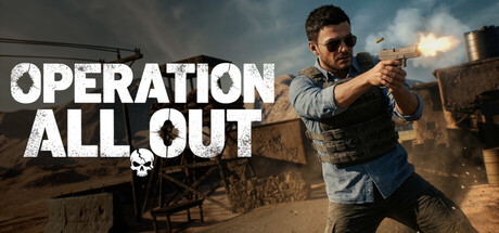
Operation: All Out is a single player third person shooter where...' with something like 'Infiltrate terrorist strongholds with only your wits, a loaded gun, and whatever ammo you can scavenge—one wrong shot could be your last.'
  2. [uniqueness] Add 1–2 sentences explaining what makes this game's resource scarcity or tactical approach distinct: e.g., 'Every bullet counts in a shooter where ammo is scarce and retreat is impossible' or similar claim that differentiates the survival pressure from standard military shooters.
  3. [feature_communication] Clarify the single-mission scope: specify whether the mission is replayable, has difficulty modes, or contains meaningful player choice that affects replayability, so the audience understands content volume.
  4. [audience_targeting] Add an explicit difficulty or skill signal (e.g., 'designed for players who want tactical, unforgiving combat') so the right audience self-identifies immediately and casual players know what they are signing up for.

Related guides

Steam app ID: 4498620 · Tags: Action, Strategy, 3D Fighter, Shooter, Third-Person Shooter