Capture The Mouse scores 68/100 — better than 17% of Turn-Based Strategy capsules (n=1,225).

Quick text summary

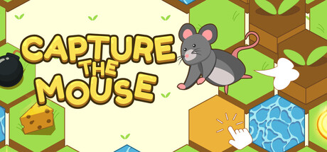
Capture The Mouse scored 68/100 on Steam Analyzer — Solid for a Turn-Based Strategy capsule. Top priority fix: [genre_clarity] Add subtle UI blocking or cage iconography to the composition to more clearly signal the strategy/blocking core mechanic at tiny size.

Capsule scores by dimension

  • Genre Clarity: 7/10 — Casual puzzle mechanics clear. The isometric grid environment, mouse character, and cheese/obstacle elements immediately signal a casual puzzle or strategy game. The visual style and blocking mechanics are recognizable at full size, though at tiny size the grid becomes muddy and genre specificity weakens to just 'cute casual game' without clear strategy signals.
  • Title Readability: 8/10 — Bold yellow text reads well. The title 'CAPTURE THE MOUSE' uses thick yellow lettering with dark outline positioned in the upper left on a pale background, ensuring strong legibility at all sizes. At tiny size it remains readable, though individual letters compress slightly; the outline treatment prevents collapse.
  • Contrast & Color: 7/10 — Bright palette pops effectively. The pale cream background with bright lime green, yellow, and blue elements creates strong value separation against Steam's dark theme. The mouse silhouette and cheese block read clearly in grayscale, though the mid-tone brown wooden beams lack distinct separation from each other at tiny size.
  • Uniqueness & Polish: 6/10 — Competent but generic casual look. The art style is clean and polished with consistent isometric rendering, but the visual composition feels like a standard casual puzzle template rather than a distinctive hook. The mouse, cheese, and grid setup communicate the concept functionally, yet nothing visually suggests what makes this game strategically unique compared to other grid-based puzzlers.
  • Brand Consistency: 6/10 — Consistent but not iconic. The palette, isometric style, and character design appear coherent internally, and the mouse protagonist could serve as a recognizable symbol. However, without referencing the 8 store screenshots, the identity reads as generic cute-casual rather than distinctive—the visual language lacks signature motifs or memorable design markers.
  • Composition: 7/10 — Clear focal point, balanced layout. The mouse character sits prominently in the center-right area with the title anchored top-left, creating good hierarchy and visual flow. The scattered cheese, water, and obstacles provide context without overwhelming; at small size the composition holds, though at tiny size the grid details blur and supporting elements lose clarity, reducing compositional nuance.

What works

  • Title legibility across sizes. Bold yellow outline text remains readable at tiny size due to strategic placement and thick stroke weight.
  • Strong color contrast against dark Steam background. Bright greens, yellows, and blues create immediate visual pop and value separation in quick-scroll conditions.
  • Clean, polished art execution. Consistent isometric perspective and smooth rendering convey quality craftsmanship without rough edges.

What hurts the capsule

  • Generic casual puzzle aesthetic. The visual presentation lacks a distinctive hook or unique selling point that differentiates it from template-style casual games.
  • Grid and background details collapse at tiny size. The brown wooden beams and green hexagonal grid become indistinct muddy patterns at 120×45px, reducing compositional clarity.
  • No memorable brand identity cues. While internally coherent, the capsule contains no iconic character pose, signature symbol, or palette marker that suggests later brand recognition.

Priority fixes

  1. [genre_clarity] Add subtle UI blocking or cage iconography to the composition to more clearly signal the strategy/blocking core mechanic at tiny size.
  2. [uniqueness_polish] Introduce a distinctive visual hook—such as a unique mouse pose/emotion, signature game state indicator, or stylistic detail—that signals what makes this puzzle game strategically novel.
  3. [composition] Increase contrast between background and grid elements; consider simplifying or desaturating the wooden structure to prevent mid-tone muddiness at small sizes.
  4. [brand_consistency] Develop a signature character expression or pose for the mouse that becomes visually consistent across all marketing materials to build brand recall.

Store copy priority fixes

  1. [uniqueness] Add one sentence explaining what makes this game distinct—e.g., 'Master over 50 hand-crafted levels' or 'Each level has multiple solutions' to set expectations and differentiate from competitors.
  2. [hook_strength] Rewrite the short description to open with a more emotional or evocative hook, such as 'Outsmart a cunning mouse in a high-stakes puzzle showdown' instead of the neutral procedural framing.
  3. [feature_communication] Clarify game structure by mentioning level count, difficulty curve, or replay incentives (e.g., 'Solve 30 levels with evolving mechanics') so players know the scope.
  4. [tone_match] Inject personality through the copy—use playful language that reflects the 'Cartoony Colorful' aesthetic and makes the game feel charming rather than generic.

Related guides

  • Steam page optimisationCapsule, copy, screenshots, tags — the full Steam page conversion stack.
  • Steam tags guideTag selection, ordering, and how it shapes Steam's recommendation rails.

Steam app ID: 4507960 · Tags: Turn-Based Strategy, Hex Grid, Grid-Based Movement, Strategy, Isometric