Scoring genre clarity...
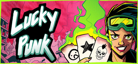
Lucky Punk: a push your luck Deckbuilder capsule

Lucky Punk: a push your luck Deckbuilder

We've distilled the roguelike deckbuilder into one simple choice: Draw or Stop. Push your luck and beat the odds in the vibrant post-apocalypse. Gather supplies and build your community. Survive and thrive in a vibrant eco-dystopia… or don’t. 1% chance. 100% choice. Do you feel lucky, Punk?

StrategySingleplayerIndie
Green Parrot Games2026

Lucky Punk: a push your luck Deckbuilder scores 67/100 — better than 12% of Roguelike Deckbuilder capsules (n=353).

Released 2026 · By Green Parrot Games

Quick text summary

Lucky Punk: a push your luck Deckbuilder scored 67/100 on Steam Analyzer — Solid for a Roguelike Deckbuilder capsule. Top priority fix: [genre_clarity] Clarify deckbuilding strategy through visual hierarchy: reduce playing card cluster complexity and emphasize a single iconic card or deck management UI element that reads 'strategy' at tiny size.

Capsule scores by dimension

  • Genre Clarity: 5/10 — Punk aesthetic obscures strategy genre. The capsule leans heavily on retro-punk visual style with a confident character, playing cards, and neon colors, but these elements communicate casual gambling or party game rather than strategic deckbuilder. At tiny size, the playing cards and punk character read as luck-based entertainment rather than the roguelike strategy positioning. The genre confusion between 'push your luck' visual language and actual strategic deckbuilding mechanics remains unresolved at all viewing sizes.
  • Title Readability: 8/10 — Bold neon title reads clearly. The 'Lucky Punk' title uses thick, high-contrast yellow lettering with a magenta shadow effect on a clean black background, ensuring strong legibility at full, small, and tiny sizes. The letterforms remain distinct and readable even at extreme reduction. The placement on the left side of a controlled dark region maximizes clarity without competing with background noise.
  • Contrast & Color: 7/10 — Vibrant palette pops against dark Steam background. The electric yellow, hot pink, and bright green combination creates strong value separation against the #1b2838 Steam background, with the neon colors deliberately chosen for visual impact and quick recognition. At tiny size, the saturated yellow and magenta silhouettes remain distinct and noticeable. However, the overall high saturation and warm-cool balance occasionally muddy the secondary elements like the playing cards in the dense central area.
  • Uniqueness & Polish: 7/10 — Stylish punk branding, execution feels cohesive. The retro arcade punk aesthetic is intentional and consistently executed across the character design, typography, and color palette, signaling a distinctive voice in a strategy genre typically dominated by serious tones. The confident smirk on the character and the playful card arrangement suggest personality and humor that differentiate it from benchmark competitors. The bold design choices feel deliberate rather than generic, though the punk theme dominates over communicating deckbuilder strategy depth.
  • Brand Consistency: 7/10 — Strong punk identity, recognizable protagonist. The character design with goggles, confident expression, and retro-punk styling establishes a memorable protagonist archetype that would be recognizable across store screenshots and marketing materials. The consistent neon yellow and hot pink color palette, along with the vintage arcade font treatment, create a cohesive internal brand language. The playing cards serve as a recurring motif that reinforces the gambling-strategy hybrid identity, though the punk veneer occasionally overshadows the deckbuilder mechanics in the visual hierarchy.
  • Composition: 6/10 — Busy center, character dominates hierarchy. The character on the right and title on the left create a balanced horizontal composition, but the playing cards clustered in the dense center create visual clutter that dilutes focal point clarity at small and tiny sizes. The green border frame adds intentional visual structure, but the overlapping cards and secondary design elements compete for attention rather than guiding the eye to a singular core message. At tiny size, the composition compresses into a busy muddle where it becomes difficult to isolate the primary subject or game concept.

What works

  • Title legibility excellence. The 'Lucky Punk' text uses thick neon yellow with strong shadow contrast that remains perfectly readable at all viewing sizes without degradation or loss of form.
  • Distinctive character silhouette. The confident punk protagonist with goggles and styled outfit creates a memorable visual identity that would be instantly recognizable in future marketing and DLC assets.
  • Bold neon color strategy. The saturated yellow, magenta, and green palette consistently pops against Steam's dark background and maintains strong value separation even in grayscale.

What hurts the capsule

  • Genre messaging mismatch. The playing cards and punk aesthetic dominate visual communication, reading more as casual luck-based game than strategic deckbuilder, misleading the target audience about gameplay depth.
  • Cluttered central composition. The dense cluster of playing cards and design elements in the middle creates visual noise that collapses into an illegible muddle at small and tiny sizes, damaging discoverability.
  • Unclear strategic positioning. Compared to benchmark strategy titles like Frostpunk 2 and Jagged Alliance 3, the capsule communicates casual entertainment rather than roguelike deckbuilder tactical depth or progression systems.

Priority fixes

  1. [genre_clarity] Clarify deckbuilding strategy through visual hierarchy: reduce playing card cluster complexity and emphasize a single iconic card or deck management UI element that reads 'strategy' at tiny size.
  2. [composition] Simplify the central area by removing or repositioning overlapping cards to create a cleaner focal point; ensure the character and title remain the clear primary subjects with supporting elements in the background.
  3. [genre_clarity] Add a subtle but recognizable strategic UI element (health bar, card draw mechanic, resource icon) to the character or title area that signals roguelike deckbuilder without abandoning the punk aesthetic.
  4. [title_readability] Test the capsule at actual Steam small and tiny sizes to verify the character and cards remain visually distinct and don't create a compressed muddy blob that obscures the title.

Store copy priority fixes

  1. [audience_targeting] Ensure the 'THIS GAME IS FOR YOU, IF YOU…' section appears in the short description or first paragraph of the detailed description, not buried mid-page, to accelerate audience self-identification.
  2. [feature_communication] Explicitly mention the 'infinite run system' or 'unlockable characters' mechanic in the short description to signal replayability value upfront alongside the core Draw/Stop mechanic.

Related guides

Steam app ID: 4508290 · Tags: Roguelike Deckbuilder, Difficult, Roguelike, Post-apocalyptic, Deckbuilding