Scoring genre clarity...
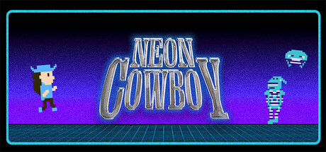
A retro 2D platformer based around the story of Starletta's debut album "Neon Cowboy". Travel out west, defeat enemies with your tears, and fight for true love-it's out there. A world where 80s nostalgia and country live together to make THE Neon Cowboy come to life!
$4.99
AdventureCasualArcade
Starletta Mar 28, 2026