Scoring genre clarity...
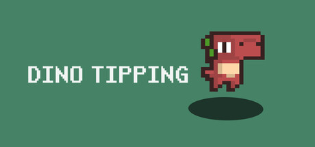
Dino-Tipping is a fast-paced infinite pixel art runner where you control a tiny dinosaur dashing at break-neck speed. Dodge barrels, rocks, birds, and more - glide, double jump, and dart left or right to survive as long as you can. How far can you go? It's said to be impossible to reach MAX lvl!
$0.993 user reviews
CasualArcadeDesign & Illustration
True-skiApr 6, 2026