Scoring genre clarity...

GRAVITAS capsule

GRAVITAS

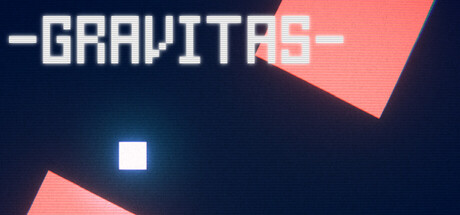
A gravity-flipping precision platformer. Navigate a series of brutal challenges as a blue cube — easy to learn, hard to master. Can you complete it in under 100 deaths? New, even more challenging levels are currently in development — So stay tuned!

$2.99
CasualArcade2D Platformer
KuHaApr 4, 2026

GRAVITAS scores 72/100 — better than 43% of Casual capsules (n=10,153).

$2.99 · Released Apr 4, 2026 · By KuHa

Quick text summary

GRAVITAS scored 72/100 on Steam Analyzer — Good for a Casual capsule. Top priority fix: [uniqueness_polish] Introduce a signature visual motif or character element (e.g., a stylized blue cube mascot or gravity-effect icon) that reinforces the core mechanic and creates lasting brand recognition.

Capsule scores by dimension

  • Genre Clarity: 7/10 — Minimalist geometric platformer. The white square at center immediately signals a minimal puzzle or platformer aesthetic, and the pink angular shapes suggest gravity/directional mechanics. At SMALL and TINY sizes, the geometric abstraction reads as a precision-based game, though the exact 'gravity-flip' mechanic is not immediately obvious without context. The color palette and minimalist shapes align with indie platformer expectations.
  • Title Readability: 8/10 — Bold, clean, legible title. GRAVITAS is rendered in a confident tech-style font with strong white letterforms and high contrast against the dark navy background. The title maintains crisp readability at SMALL size and remains partially legible at TINY, though individual letters begin to merge. Strategic placement in the upper-left area keeps it clear of the competing geometric shapes and the central focal point.
  • Contrast & Color: 8/10 — Strong value separation, modern palette. White title and central blue-white cube pop sharply against the dark navy background, creating excellent silhouette clarity. The coral-pink angular shapes provide warm saturation contrast and guide the eye naturally. At TINY size, the light elements remain distinctly separated in grayscale, and the composition avoids muddy mid-tones that would collapse the design on quick scroll.
  • Uniqueness & Polish: 7/10 — Distinctive minimalist approach, clean craft. The geometric abstraction and color restraint feel intentional and premium rather than generic. The visual language—pink angles, centered white square, tech typography—communicates a polished indie sensibility without relying on heavy particle effects or crowded scenes. However, the design relies primarily on color and shape rather than narrative storytelling, which keeps it competent but not exceptionally memorable.
  • Brand Consistency: 6/10 — Cohesive geometry, limited iconic anchors. The design maintains internal consistency through geometric minimalism and a restrained color palette of navy, white, coral, and cyan-blue. The white cube is a strong central motif that could serve as brand identity, but the capsule lacks distinctive character traits or memorable symbols that would make it uniquely recognizable across multiple exposures. The style is clean but not particularly distinctive compared to contemporary minimalist indie games.
  • Composition: 7/10 — Clear hierarchy, centered focus, balanced. The white square anchors the center with strong focal pull, while the pink angular shapes frame it without overwhelming. Title placement upper-left respects safe margins and Steam cropping. At SMALL and TINY sizes, the composition remains readable with clear primary subject; however, the symmetric balance and geometric abstraction offer limited dynamic tension or narrative depth that might elevate it further.

What works

  • Excellent title contrast and legibility. White GRAVITAS typography reads sharply at all sizes and sits cleanly against the dark background without visual competition.
  • Cohesive minimalist visual identity. The restrained palette and geometric shapes create a premium, intentional aesthetic that avoids generic asset or template feel.
  • Strong value separation at scale. The composition maintains clear silhouettes and visual distinction even when collapsed to TINY thumbnail size, supporting quick discoverability.

What hurts the capsule

  • Limited iconic brand anchors. While clean, the design lacks memorable character traits or signature motifs that would create strong brand recall across multiple game exposures.
  • Minimal narrative or mechanic storytelling. The capsule conveys 'minimalist indie game' rather than clearly communicating the specific gravity-flip platformer hook or challenge appeal.
  • Geometric abstraction limits emotional connection. The abstract shapes and tech aesthetic may appeal to puzzle fans but offer limited visual warmth or personality to attract broader casual audiences.

Priority fixes

  1. [uniqueness_polish] Introduce a signature visual motif or character element (e.g., a stylized blue cube mascot or gravity-effect icon) that reinforces the core mechanic and creates lasting brand recognition.
  2. [genre_clarity] Add subtle directional or gravity-related visual cues (e.g., an arrow, trajectory line, or gravity vector) to more explicitly signal the 'gravity-flip' platformer mechanic at TINY size.
  3. [brand_consistency] Develop consistent rendering treatment and signature color accent across store screenshots and secondary assets to build a more distinctive visual identity beyond minimalism.

Store copy priority fixes

  1. [feature_communication] Add one concrete example of how gravity-flipping changes the platformer formula (e.g., 'flip gravity mid-jump to avoid obstacles or access hidden paths') to make the core mechanic tangible.
  2. [uniqueness] Replace or supplement the Super Meat Boy comparison with a sentence explaining what gravity manipulation adds to the precision platformer genre specifically to this game.
  3. [audience_targeting] Add a sentence clarifying the primary audience: 'Perfect for players who love tight, challenging platformers with a physics twist' or similar to sharpen targeting.

Related guides

Steam app ID: 4533210 · Tags: Casual, Arcade, 2D Platformer, 2D, Abstract