Scoring genre clarity...
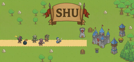
SHU is a strategic tower defense game where you place and upgrade archers, mages, and artillery towers to stop waves of goblins and warriors from reaching your base. Earn gold, manage your defenses, and build your own custom maps with the built-in map editor.
$2.002 user reviews
ActionAdventureStrategy
FURKAN OZKANApr 2, 2026