Scoring genre clarity...
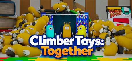
Climb, jump, and try not to fall in this chaotic 8-player co-op parkour adventure set in a toy-filled room. Dodge obstacles, use your abilities, and stay on track — because one mistake can send you all the way back down. Try not to lose everything… or each other.
$4.99Positive(13)
CasualPlatformerMultiplayer
Violet StudiosApr 24, 2026