Scoring genre clarity...
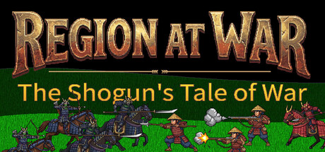
Conquer the fractured lands of Hinomoto. Blend deep turn-based empire management with thrilling real-time tactical battles in this 2D strategy game. Build your cities, research vital technologies, and lead your samurai armies to become the undisputed Shogun of the Sengoku era!
$9.991 user reviews
StrategyGrand StrategyRTS
ngotak game studioMay 7, 2026