Scoring genre clarity...

Unanswered capsule

Unanswered

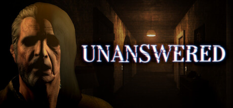
You wake up in a strange place, not knowing who you are, where you are, or how you got here. Trapped in an environment that twists to break your sanity, your only way out is to delve into the unknown and face the horrors of a past your mind is trying to hide.

Free to PlayVery Positive(61)
IndiePsychological HorrorHorror
WhiteRoot StudioMay 15, 2026

Unanswered scores 77/100 — better than 78% of Indie capsules (n=11,449).

Very Positive (61 reviews) · Free to Play · Released May 15, 2026 · By WhiteRoot Studio

Quick text summary

Unanswered scored 77/100 on Steam Analyzer — Good for a Indie capsule. Top priority fix: [uniqueness_polish] Introduce a distinctive visual motif or symbolic element (e.g., a fragmented memory visual, abstracted identity symbol, or signature UI element) that creates immediate brand recognition and sets this apart from generic horror peers.

Capsule scores by dimension

  • Genre Clarity: 8/10 — Strong psychological horror atmosphere. The haunted corridor setting, distorted face, and institutional lighting immediately signal psychological thriller or horror adventure. At tiny size, the eerie hallway and anguished character silhouette clearly communicate dread and survival tension rather than action or puzzle genres. The overall visual reads as mystery-horror with strong atmospheric intent.
  • Title Readability: 9/10 — Bold, clean, highly legible text. The word 'UNANSWERED' is rendered in strong white sans-serif with excellent contrast against the dark background and positioned strategically in the right portion of the composition. At small and tiny sizes, the title remains perfectly readable with clear letter separation and no decorative obfuscation. The placement avoids clashing with the character element on the left.
  • Contrast & Color: 8/10 — Excellent value separation and pop. Strong dark-to-light contrast with warm golden tones on the character's face and corridor lighting popping sharply against deep blacks and muddy browns. The white title text creates immediate eye-catch, and the warm institutional lighting gives visual depth that reads clearly even when squinted. Silhouette separation is clean; the character distinctly separates from the shadowy hallway background.
  • Uniqueness & Polish: 7/10 — Polished but familiar horror trope. The execution is clean with good 3D rendering, atmospheric lighting, and thematic cohesion, but the 'disheveled person in dark corridor' concept is well-trodden in psychological horror marketing. The capsule feels professionally crafted and visually effective without introducing a distinctive visual hook or memorable identity that separates it from genre peers like DREDGE or other indie horror titles. Solid presentation that doesn't surprise.
  • Brand Consistency: 6/10 — Consistent visual tone, generic identity. The warm-toned institutional horror aesthetic is internally cohesive across lighting, color palette, and thematic cues, suggesting consistent art direction. However, without examining the 9 store screenshots, the capsule alone presents no iconic character motif, distinctive symbol, or signature visual element that would make this game immediately recognizable in isolation. The style is competent but not distinctly branded.
  • Composition: 8/10 — Clear hierarchy, well-balanced layout. The character face anchors the left third as focal point, the title dominates the right with strong visual weight, and the corridor extends through the center creating natural depth layering. At tiny size, the composition remains legible with clear primary (face/title) and secondary (hallway) elements that don't fight for attention. Safe margins are respected; title placement avoids edge-hugging and the character silhouette is fully contained.

What works

  • Title legibility at all sizes. White sans-serif 'UNANSWERED' reads perfectly from full size through tiny thumbnail with no letterform collapse or contrast loss.
  • Atmospheric contrast and depth. Warm character lighting against cool dark hallway creates strong value separation that survives squinting and grayscale conversion while maintaining visual hierarchy.
  • Clear genre communication. Psychological horror intent is unmistakable through institutional setting, anguished expression, and eerie corridor framing without genre ambiguity.

What hurts the capsule

  • Generic visual concept. The 'disoriented figure in dark corridor' composition is a familiar horror marketing pattern that lacks a distinctive selling point or unique visual hook.
  • No memorable brand identity. The capsule presents no iconic character, symbol, or signature palette element that would make the game visually distinctive or recognizable outside this context.
  • Limited compositional narrative. While technically sound, the layout doesn't visually communicate the core mystery or amnesia mechanic—just generalized unease rather than thematic specificity.

Priority fixes

  1. [uniqueness_polish] Introduce a distinctive visual motif or symbolic element (e.g., a fragmented memory visual, abstracted identity symbol, or signature UI element) that creates immediate brand recognition and sets this apart from generic horror peers.
  2. [genre_clarity] Add subtle visual hints of the amnesia/sanity-twist mechanic (e.g., distorted overlay, fractured reality cues, or thought-bubble imagery) to communicate the unique psychological gameplay hook rather than just atmospheric dread.
  3. [brand_consistency] Establish an iconic character design or recurring visual signature that anchors the game's identity across all marketing materials and is immediately recognizable at thumbnail scale.

Store copy priority fixes

  1. [feature_communication] Add a sentence explaining how the stress system works mechanically: specific triggers, visual/audio feedback, and what happens when stress reaches critical levels (e.g., 'High stress blurs your vision and slows your movement, making threats more dangerous').
  2. [uniqueness] Add 1-2 sentences after the Limbo paragraph clarifying what makes UNANSWERED distinct: e.g., 'The dual flashlight system forces you to constantly switch tools to uncover hidden paths, creating tension between exploration speed and safety' or a concrete example of how UV and standard light interact.
  3. [audience_targeting] Insert a sentence early in the detailed description that signals difficulty or player type: e.g., 'Designed for players who value puzzle-solving and environmental storytelling over fast-paced combat' or 'Hardcore horror fans seeking a cerebral challenge.'

Related guides

Steam app ID: 4539950 · Tags: Indie, Psychological Horror, Horror, Adventure, First-Person