Scoring genre clarity...

Nothing Remains capsule

Nothing Remains

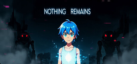
A fast-paced hack-and-slash action game set in a collapsing futuristic universe, where you fight enemies controlled by a supreme AI using melee combat and light-based powers. Developed by a solo creator as their first project.

Free to Play5 user reviews
AdventureAction-AdventureAction
Diego GacitúaApr 15, 2026

Nothing Remains scores 70/100 — better than 33% of Adventure capsules (n=7,922).

5 user reviews · Free to Play · Released Apr 15, 2026 · By Diego Gacitúa

Quick text summary

Nothing Remains scored 70/100 on Steam Analyzer — Good for a Adventure capsule. Top priority fix: [uniqueness_polish] Add a distinctive visual hook—such as a signature weapon design, unique light-effect signature, or environmental detail—that immediately separates this from generic anime action competitors

Capsule scores by dimension

  • Genre Clarity: 7/10 — Anime action protagonist, clear but generic. The blue-haired anime character in combat stance with glowing effects and dark futuristic city backdrop clearly signals action gameplay. The silhouetted enemy robots and neon lighting reinforce a sci-fi action setting, though at TINY size the anime artstyle dominates more than hack-and-slash specificity. The genre reads as action-adventure but lacks distinctive visual cues that separate it from broader anime action titles.
  • Title Readability: 8/10 — Clean, centered, readable at all sizes. NOTHING REMAINS is rendered in clean white sans-serif typeface centered above the protagonist with ample breathing room and strong contrast against the dark background. The text maintains excellent legibility at SMALL and TINY sizes due to generous letter spacing and lack of decorative elements. No taglines or secondary text compete for attention, making it one of the most immediately parseable elements on the capsule.
  • Contrast & Color: 8/10 — Strong cyan and red accent strategy. The character's bright cyan hair and glowing blue/white aura create excellent value separation against the deep navy-black background, with red robot eyes providing secondary color pop. The grayscale silhouette test shows clear foreground-background separation with the protagonist distinctly lighter than the environment. At TINY size the cyan and red accents remain visible enough to guide the eye toward the focal point despite overall darkness.
  • Uniqueness & Polish: 6/10 — Polished anime aesthetic, familiar execution. The rendering quality and lighting effects on the character model are clean and professional, with smooth glowing effects and well-integrated particle details suggesting solid production value. However, the composition—anime protagonist in center with generic dark city backdrop and robot silhouettes—closely mirrors dozens of other indie action titles, particularly free-to-play anime games. The capsule demonstrates craft but lacks a distinctive visual hook or mechanic signifier that distinguishes it from competitor aesthetics.
  • Brand Consistency: 6/10 — Cohesive but generic anime-action identity. The cyan-blue color palette, anime character design, neon glow effects, and sci-fi environment create internal visual cohesion and establish a recognizable tone. The aesthetic is internally consistent and matches typical anime action game branding, but without a distinctive mascot trait, signature symbol, or unique stylistic twist that would make this game's visual identity memorable across different assets. The brand reads as competent anime-action rather than uniquely identifiable.
  • Composition: 7/10 — Centered focal point, good depth layering. The protagonist is positioned as a strong primary focal point in dead center with title above and environment silhouettes behind and beside, creating clear foreground-midground-background depth. The layout remains readable at SMALL and TINY sizes with the character remaining the dominant element. Safe margins are respected and no critical elements hug dangerous edges, though the centered-heavy composition feels slightly static and the flanking robot silhouettes contribute to a busier secondary layer that could compete for attention at lower resolutions.

What works

  • Excellent title legibility. Clean sans-serif white text with strong contrast and ample spacing reads perfectly at all sizes from full header down to tiny thumbnail.
  • Strong color contrast foundation. Cyan protagonist and red robot accents pop distinctly against the dark navy background, maintaining visual hierarchy even at tiny sizes.
  • Professional rendering quality. Character model lighting, glow effects, and particle details demonstrate polished production craftsmanship that feels premium rather than rushed.

What hurts the capsule

  • Generic anime-action template feel. The centered anime protagonist with glowing aura and dark sci-fi backdrop closely mirrors dozens of other indie and free-to-play action titles, limiting visual distinction.
  • Lack of gameplay clarity beyond genre. While the image reads as action, there are no specific visual cues that communicate hack-and-slash mechanics, light-based powers, or the unique AI villain concept—just a generic anime action setup.
  • Static centered composition. Placing the character dead center with symmetrical flanking robots creates a safe but visually predictable layout that lacks dynamic energy or unusual focal balance.

Priority fixes

  1. [uniqueness_polish] Add a distinctive visual hook—such as a signature weapon design, unique light-effect signature, or environmental detail—that immediately separates this from generic anime action competitors
  2. [genre_clarity] Incorporate a specific mechanic signifier into the composition, such as a dynamic combat pose, visible light-based ability effect, or UI element that hints at the hack-and-slash or power-based gameplay
  3. [composition] Shift protagonist positioning off-center or introduce asymmetrical depth layering to create visual dynamism and reduce the template-familiar feel of centered anime character setups

Store copy priority fixes

  1. [genre_clarity] Add one sentence explicitly mentioning platforming or traversal if it is a core mechanic (e.g., 'Traverse sci-fi environments with platforming challenges and combat encounters').
  2. [uniqueness] Replace vague 'light-based powers' with a concrete example of how they function or differ from standard abilities (e.g., 'Harness light-based abilities to solve environmental puzzles and overwhelm enemies').
  3. [audience_targeting] Add a single sentence clarifying scope and intended player type (e.g., 'A concise, story-light experience ideal for players seeking atmospheric action over grinding progression' or similar).
  4. [hook_strength] Move the 'solo creator' detail to the end of the detailed description (already present) and strengthen the short description's opening with a more evocative verb or emotional stake (e.g., 'As a lone warrior, you wield mysterious light powers to prevent a simulated world from collapsing').

Related guides

Steam app ID: 4541800 · Tags: Adventure, Action-Adventure, Action, Casual, Sci-fi