Scoring genre clarity...
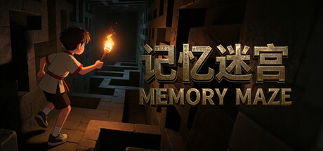
Memory Maze is a game that breaks away from the traditional maze format—which typically grants a full overview of the map—opting instead to have players explore a pitch-black labyrinth while holding a limited light source, relying solely on their memory to retrace their steps and complete the levels
$2.99
CasualAdventureDungeon Crawler
Director LiuApr 8, 2026