The Baron's Burden: One Fortnight scores 73/100 — better than 62% of Medieval capsules (n=1,343).

Quick text summary

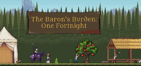
The Baron's Burden: One Fortnight scored 73/100 on Steam Analyzer — Good for a Medieval capsule. Top priority fix: [genre_clarity] Add a visual cue that emphasizes the 14-day time limit—such as a small calendar icon or sand timer—to differentiate from infinite farm sims and communicate the unique time-pressure mechanic.

Capsule scores by dimension

  • Genre Clarity: 8/10 — Medieval farming sim clearly signaled. The capsule immediately communicates a medieval management game through multiple genre-specific cues: pixel art peasants working fields, a fruit tree, wooden structures, thatched roofs, and a pastoral landscape. At tiny size, the silhouettes of workers and farm buildings remain readable and clearly suggest resource management gameplay. The medieval aesthetic is unmistakable and aligns perfectly with the casual farming sim category.
  • Title Readability: 7/10 — Gold text readable at small sizes. The title 'The Baron's Burden: One Fortnight' uses a warm gold serif font on a dark brown banner background, providing strong contrast and clear legibility at full and small sizes. At tiny size, the overall text remains distinguishable though some letter detail softens; the banner placement above the scene prevents overlap with busy background elements. The subtitle and main title work together hierarchically without competing for attention.
  • Contrast & Color: 8/10 — Strong value separation from dark background. The light blue sky and warm tan/brown building tones create excellent separation from the Steam dark background (#1b2838), while the gold title banner pops distinctly against the darker landscape. Character silhouettes and architectural forms maintain crisp edges even at small sizes due to the clear light-to-dark progression from foreground figures to green mid-tone grass and teal sky. In grayscale, the composition holds strong silhouette clarity with no muddy blending.
  • Uniqueness & Polish: 7/10 — Polished pixel art with cohesive style. The art direction showcases consistent, clean pixel art across buildings, characters, vegetation, and landscape elements with a warm, earthy medieval color palette that feels intentional and premium for the indie space. The composition tells a visual story of active farming—showing workers, animals, and multiple building types in a single frame communicates the core loop. However, the scene remains somewhat within expected medieval farming aesthetic conventions without a highly distinctive hook that separates it from similar titles like Tiny Glade or Moonstone Island.
  • Brand Consistency: 6/10 — Competent consistency within genre norms. The pixel art style, medieval palette, and farming scene are internally coherent and would likely match the in-game aesthetic based on typical indie simulation presentation. The brown/gold banner and teal-green landscape palette appear consistent with a unified art direction. Without access to full brand identity across multiple marketing materials, the design reads as professionally executed but relies on genre-standard visual language rather than a uniquely memorable brand signature like Dave the Diver or Dredge offer.
  • Composition: 8/10 — Balanced hierarchy with clear focal point. The title banner anchors the top third with confident weight, while the landscape below distributes attention across multiple activity zones—left peasant group, center tree, right farm buildings—creating visual rhythm without scattered focus. The eye naturally reads the scene as a managed environment with depth layering: foreground peasants, mid-ground farm infrastructure, background trees and sky. At small and tiny sizes, the composition remains legible with the title prominent and the scene readable as a cohesive farm management moment; safe margins protect key elements from cropping.

What works

  • Genre clarity through visual storytelling. Multiple farming activities visible simultaneously (workers, crops, animals, buildings) instantly communicate the resource management core loop.
  • Title legibility and strategic placement. Gold serif text on a dark banner sits cleanly above the scene without competing with background texture, maintaining readability at all sizes.
  • Strong contrast separation. Light sky, warm buildings, and character silhouettes stand out distinctly against the dark Steam background with clear value and color separation.
  • Balanced composition hierarchy. The scene distributes focal interest across left, center, and right zones while the title anchors the visual weight, creating a memorable layout.

What hurts the capsule

  • Limited visual distinctiveness. While well-executed, the pixel art medieval farming aesthetic closely aligns with existing successful titles (Tiny Glade, Moonstone Island) without a standout visual signature.
  • Generic character design. The peasant figures and overall scene follow expected indie farming game visual conventions without iconic or particularly memorable character traits.
  • Unclear time pressure messaging. The 'One Fortnight' mechanic is core to the game but isn't visually communicated in the capsule; a calendar or timer element could reinforce the unique time-limit constraint.

Priority fixes

  1. [genre_clarity] Add a visual cue that emphasizes the 14-day time limit—such as a small calendar icon or sand timer—to differentiate from infinite farm sims and communicate the unique time-pressure mechanic.
  2. [uniqueness_polish] Introduce a distinctive brand element like a stylized Baron character, a signature visual motif, or a more unique color accent to stand out among similar farming sims at tiny size.
  3. [brand_consistency] Ensure the peasant clothing colors or a central character silhouette remains consistent across all marketing materials to build visual recognition over time.

Store copy priority fixes

  1. [feature_communication] Expand the detailed description to explain the core gameplay loop: e.g., 'Each day, assign peasants to plots, tend crops, and manage livestock. The King's demands appear weekly—gather resources or face penalties. Balance growth with immediate compliance.'
  2. [genre_clarity] Revise the short description to frontload the roguelite structure: 'A medieval roguelite farming sim where you have fourteen days to satisfy an ever-changing king. Manage crops, peasants, and animals across multiple runs, unlocking new tools and challenges.'
  3. [uniqueness] Add a sentence clarifying the king AI's mechanical impact: 'Each king has a unique personality and threshold for patience—plan your farms differently against tyrants versus merciful rulers.'
  4. [feature_communication] Explain the companion system in 1-2 sentences: what does it do, how does it unlock, and how does it change gameplay?

Related guides

Steam app ID: 4542610 · Tags: Medieval, Farming Sim, Casual, Simulation, Resource Management