Scoring genre clarity...
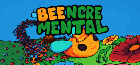
Beencremental capsule

Beencremental

Beencremental is an incremental Game about Bees. Grow an unstoppable swarm and conquer the four seasons, devouring every flower in your path! Drive your queen with your mouse, Gather Pollen, Gamble it into a Plinko machine and grow your hive trough a Tech Tree!

IncrementalCasualIdler
DamianArtClubTo be announced

Beencremental scores 83/100 — better than 93% of Incremental capsules (n=1,373).

Released To be announced · By DamianArtClub

Quick text summary

Beencremental scored 83/100 on Steam Analyzer — Good for a Incremental capsule. Top priority fix: [composition] Slightly reduce flower density at bottom edge to ensure the bee remains the unmistakable focal point even during ultra-fast scrolls at tiny size.

Capsule scores by dimension

  • Genre Clarity: 8/10 — Clear casual indie charm. The bee protagonist, colorful flora, and whimsical art style immediately signal a casual indie game rather than a serious simulator. At tiny size, the oversized bee character and vibrant nature setting remain recognizable as a lighthearted game about creature collection or growth mechanics. The visual theme aligns well with incremental gameplay expectations where the player sees progression through visual abundance.
  • Title Readability: 9/10 — Excellent legibility and visual separation. The title 'BEENCREMENTAL' uses bold, chunky letterforms with strong orange and green color separation that maintains excellent contrast against the blue sky background. At small and tiny sizes, the stacked two-line layout and thick strokes preserve readability without degradation. The letterforms are simple enough to remain clear even under mental blur, and the colors pop distinctly from the background.
  • Contrast & Color: 9/10 — Strong value separation and saturation. The composition uses bright primary colors (orange text, green text, cyan bee eye, blue sky) that create excellent contrast against the warm background palette. At tiny size, the bee silhouette reads clearly due to its orange fill and dark outline, while the title maintains strong foreground presence. Grayscale test shows solid value separation between text, bee, and sky; no muddy mid-tones collapse the visual hierarchy.
  • Uniqueness & Polish: 8/10 — Distinctive art style and clear concept. The hand-drawn aesthetic, playful bee character with expressive features, and densely packed flora convey a memorable indie personality. The visual concept of a bee swarm game is immediately communicated through the oversized protagonist and surrounding flowers, which differentiates it from generic incremental fare. The chunky, custom typography and consistent soft-edge illustration style feel intentional and cohesive rather than template-based.
  • Brand Consistency: 8/10 — Recognizable bee-centric identity. The bee character is the focal point and serves as a strong brand anchor; its exaggerated proportions, cyan eye, and orange coloring make it iconic and memorable. The warm, earthy color palette (orange, green, browns, sky blue) feels consistent across the entire composition. The hand-drawn, slightly chunky art style would be recognizable across promotional materials and screenshots as part of this game's visual DNA.
  • Composition: 8/10 — Clear focal point with layered depth. The oversized bee dominates center-left, naturally drawing the eye, while the title sits cleanly at top-center without competing for attention. Background sky, midground bee, and foreground flora create clear depth layering that guides the viewer's gaze intuitively. At small and tiny sizes, the bee remains the unmistakable primary subject, and the title placement avoids the noisy flower area, ensuring both read well during quick scrolls.

What works

  • Bold, legible typography. The thick, chunky title letters in contrasting orange and green colors maintain perfect readability at all sizes including tiny thumbnails.
  • Distinct visual identity. The oversized bee protagonist with expressive cyan eye and orange coloring is an iconic brand anchor that immediately signals the game's unique concept.
  • Strong color harmony. The vibrant primary palette (orange, green, cyan, blue) creates excellent contrast against the Steam background without feeling garish or overwhelming.
  • Clear genre signaling. The whimsical art style, nature setting, and character-driven composition immediately communicate casual indie tone rather than a serious simulator.

What hurts the capsule

  • Dense bottom composition. The clustered flowers and environmental details at the bottom create visual clutter that could distract from the bee focal point at smaller sizes.
  • Flower variety lacks coherence. The multiple flower types and colors at the bottom, while colorful, don't form a clear secondary focal point and feel somewhat scattered.

Priority fixes

  1. [composition] Slightly reduce flower density at bottom edge to ensure the bee remains the unmistakable focal point even during ultra-fast scrolls at tiny size.
  2. [contrast_color] Verify the cyan eye maintains visibility at 120x45px; consider a subtle dark outline if it reads as a flat spot at thumbnail size.

Store copy priority fixes

  1. [hook_strength] Rewrite the opening to lead with a hook like 'Build an unstoppable bee empire by collecting pollen and gambling it into honey production' instead of restating the title and genre.
  2. [feature_communication] Add 1-2 sentences explaining the progression arc and what makes late-game rewarding—prestige mechanics, seasonal challenges, or hive-building strategy depth.
  3. [uniqueness] Insert a specific sentence about what Plinko integration or Dandelion wish system does mechanically that differentiates this from other incremental games.
  4. [tone_match] Proofread and correct 'colorfull' → 'colorful' and 'trough' → 'through' to restore perceived quality and polish.

Related guides

Steam app ID: 4545940 · Tags: Incremental, Casual, Idler, Point & Click, 2D