Scoring genre clarity...
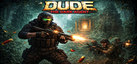
Dude The Dark Agent, klasik 90'lar FPS ruhunu modern özelliklerle buluşturan 2.5D aksiyon oyunu. Raycasting motoruyla işlenen yoğun orman haritalarında, düşman askerleri avla, antik heykelleri parçala ve her köşede seni bekleyen tehlikelere karşı hayatta kal.
$1.491 user reviews
Arena ShooterHero ShooterLooter Shooter
ismail ozel gamesApr 11, 2026