Scoring genre clarity...

Get Rid Of Those Corners capsule

Get Rid Of Those Corners

Clear all sides of the shapes inhabiting this geometric incremental game to trigger unpredictable physical chain reactions, powered by over 130 upgrades available in your skill tree.

$2.99Positive(15)
CasualRelaxing2D
Physical Salad StudiosMay 7, 2026

Get Rid Of Those Corners scores 68/100 — better than 18% of Casual capsules (n=10,153).

Positive (15 reviews) · $2.99 · Released May 7, 2026 · By Physical Salad Studios

Quick text summary

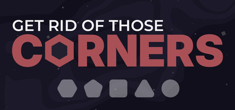
Get Rid Of Those Corners scored 68/100 on Steam Analyzer — Solid for a Casual capsule. Top priority fix: [uniqueness_polish] Replace the generic starfield background with a visual hint of the chain-reaction mechanic—such as particle trails, impact effects, or a stylized geometric cascade—to communicate the game's core selling point.

Capsule scores by dimension

  • Genre Clarity: 7/10 — Geometric puzzle mechanic clear. The five hexagon/polygon shapes at bottom center immediately signal a shape-manipulation puzzle game, with the emphasis on corner removal matching the title tagline. At TINY size, the geometric icon row still reads as game objects, though the specific mechanic (corner destruction) is not perfectly clear from visuals alone without reading text.
  • Title Readability: 8/10 — Strong contrast, clear hierarchy. White sans-serif 'GET RID OF THOSE' on dark background provides excellent contrast and remains legible at SMALL and TINY sizes. The word 'CORNERS' in large salmon-red bold variant creates proper hierarchy and visual emphasis. The tagline placement and color separation work well even when viewed at 120×45 thumbnail scale.
  • Contrast & Color: 8/10 — High value separation, readable. White title text and salmon-red 'CORNERS' word pop cleanly against the dark navy background with strong value contrast. The gray geometric shapes at bottom also separate well from the background. Grayscale squint test shows clear silhouettes; no muddy mid-tones obscure the core message even at tiny size.
  • Uniqueness & Polish: 6/10 — Competent but generic presentation. The geometric shape row is thematically appropriate and clean, but the overall composition feels like a straightforward typography exercise rather than a distinctive visual hook. The dark starfield background is a common indie game trope. The design is polished and functional but lacks a memorable art style or visual storytelling that communicates the incremental upgrade progression or chain-reaction mechanic that makes the game unique.
  • Brand Consistency: 5/10 — Minimal identity cues present. The salmon-red color and geometric shape motif are consistent internal elements, but there are no iconic character, logo, or signature palette markers that would make this recognizable across multiple touchpoints. Without reference to the five store screenshots, this could apply to many polygon-based puzzle games. The design is cohesive but forgettable as a brand identifier.
  • Composition: 7/10 — Clear hierarchy, functional layout. The two-line title with red emphasis creates natural focal hierarchy, with the geometric shape row anchoring the bottom as a supporting visual element. The composition is well-centered and balanced; however, at TINY size, the shapes compress into an undifferentiated bar, losing individual impact. The safe margins appear adequate, though the starfield texture adds minor visual noise that does not materially hurt readability.

What works

  • Excellent title contrast and color coding. White base text with bold red accent word creates immediate visual hierarchy that reads perfectly at all sizes from full header to tiny thumbnail.
  • Thematic shape iconography. The five geometric shapes directly communicate the game's core subject matter and serve as a visual anchor that reinforces the 'corners' mechanic theme.
  • Clean sans-serif typography. The letterforms are crisp, well-spaced, and maintain legibility even when compressed to small sizes without decorative flourishes that would collapse.

What hurts the capsule

  • Generic dark starfield background. The scattered star texture is a common indie game cliché that adds no distinctive visual identity and could appear on dozens of unrelated titles.
  • Shapes lose individual readability at tiny size. The five polygon icons compress into a gray blur when viewed at 120×45 pixels, reducing the visual clarity of the bottom-row supporting element.
  • No visual indication of unique mechanics. The capsule does not communicate the incremental progression, chain-reaction physics, or 130-upgrade skill tree that differentiate this game from generic shape puzzles.
  • Limited brand identity markers. There are no iconic symbols, character silhouettes, or signature motifs that would allow instant recognition on a crowded store shelf or sequel launch.

Priority fixes

  1. [uniqueness_polish] Replace the generic starfield background with a visual hint of the chain-reaction mechanic—such as particle trails, impact effects, or a stylized geometric cascade—to communicate the game's core selling point.
  2. [brand_consistency] Introduce a signature color palette or iconic geometric motif (logo mark or recurring symbol) that can serve as a consistent brand identifier across future marketing and game updates.
  3. [composition] Increase the size and visual weight of the shape icons or redesign them to remain individually distinct and readable when compressed to tiny thumbnail size, or replace them with a single symbolic icon that reads clearly at all scales.

Store copy priority fixes

  1. [tone_match] Replace aggressive action language ('Forcefully propel,' 'massive damage,' 'reduce to ashes') with language that emphasizes the satisfying, meditative destruction loop and chill progression—e.g., 'Watch shapes elegantly crumble as your upgrades compound' or 'Enjoy a relaxing cascade of geometric breakdowns.'
  2. [uniqueness] Add a sentence explaining the specific appeal of physics + incremental mechanics together—e.g., 'Unlike traditional idle games, each upgrade changes how shapes physically behave, creating emergent destruction chains' or similar claim that justifies the combination.
  3. [audience_targeting] Clarify progression model by adding a line like 'Play actively or let upgrades work for you—progression happens at your pace' to signal idle-friendly mechanics and reduce friction for new players unfamiliar with how passive this game is.

Related guides

Steam app ID: 4550150 · Tags: Casual, Relaxing, 2D, Isometric, Minimalist