Scoring genre clarity...
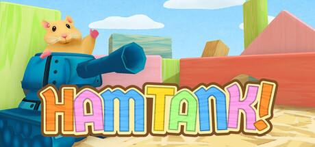
This is a top-down shooting game where a small and adorable hamster pilots a gigantic tank to fight off enemies. Players control the tank from a bird’s-eye view, shooting at enemies that attack from all directions while progressing through each stage.
Free to PlayPositive(25)
ActionCasualArcade
Vantan Game AcademyMay 29, 2026