Quick text summary
Vampire Pumpkin Plot scored 68/100 on Steam Analyzer — Solid for a Boomer Shooter capsule. Top priority fix: [uniqueness_polish] Add a distinctive art style or stylization—custom cel shading, pixel art overlay, or unique pumpkin design—to signal a premium indie product rather than generic Halloween asset.
Capsule scores by dimension
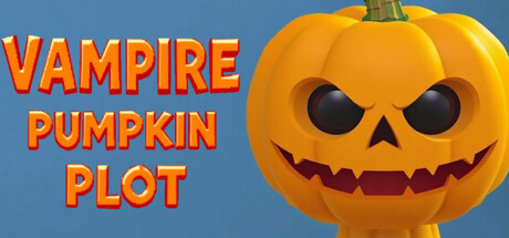
- Genre Clarity: 7/10 — Halloween action shooter clear. The jack-o'-lantern pumpkin with menacing expression and Halloween imagery immediately signals a themed action game, supported by the 'Vampire Pumpkin Plot' title that reinforces the horror-comedy tone. At tiny size, the large pumpkin face remains readable as the core visual hook, though the boomer shooter specifics are not visually obvious without text context.
- Title Readability: 8/10 — Bold orange text legible throughout. The title uses a thick, uppercase sans-serif font in bright orange (#FF9933 range) positioned vertically on the left side against a solid blue background, ensuring strong separation from the pumpkin. Even at tiny size, the three-line stack remains readable due to high contrast and generous letter spacing; the outline clarity holds well during small capsule viewing.
- Contrast & Color: 8/10 — Strong value separation and saturation. Orange title text and warm yellow-orange pumpkin create excellent luminosity contrast against the cool blue background, with the dark pumpkin eyes and mouth providing additional focal definition. The grayscale test shows clear silhouette separation; the pumpkin's bright midtones stand distinctly apart from both the dark blue void and darker facial features, maintaining visual punch even at thumbnail sizes.
- Uniqueness & Polish: 6/10 — Competent Halloween theme, generic execution. The concept of a vampire pumpkin antagonist is thematically cohesive and fits the genre, but the execution relies on a standard 3D pumpkin model with conventional jack-o'-lantern lighting—a familiar asset-heavy look common in casual Halloween games. The capsule lacks distinctive stylization, unique art direction, or a memorable visual hook that signals why this shooter stands apart from other indie action titles; it communicates the theme but not a unique selling point.
- Brand Consistency: 5/10 — Minimal internal identity signals. The capsule shows consistent color harmony (orange, yellow, blue) and a cohesive Halloween theme, but lacks iconic character design, signature motifs, or recognizable identity cues that would allow recall across marketing materials. Without reference to the 9 store screenshots, there is no distinctive visual signature—the pumpkin is a generic Halloween asset rather than a branded character or symbol unique to this title.
- Composition: 7/10 — Clear focal point, balanced layout. The pumpkin occupies center-right dominance as the primary focal point, while the stacked title text anchors the left third, creating a balanced asymmetrical layout that reads clearly at all sizes. The blue background provides safe margins and breathing room; at small/tiny sizes, the composition remains uncluttered with a single clear subject, though the title placement slightly competes for attention rather than fully supporting the pumpkin as hero.
What works
- High contrast title legibility. Bright orange bold serif text on solid blue background maintains readability from full size down to tiny thumbnail without collapse or blur loss.
- Strong color value separation. Warm orange/yellow pumpkin and text pop decisively against cool blue background, creating visual impact in quick-scroll and grayscale contrast testing.
- Uncluttered focal hierarchy. Single dominant pumpkin silhouette with supporting title text guides the eye efficiently without scattered competing elements.
What hurts the capsule
- Generic 3D asset feel. The pumpkin model appears to be a standard asset with conventional lighting rather than a stylized or custom-crafted character, reducing premium perception.
- Weak brand identity signals. No iconic motif, signature palette, or recognizable character design that communicates a unique game identity—relies entirely on Halloween theme clichés.
- Boomer shooter identity absent. The capsule communicates Halloween action-horror but gives no visual cue to the retro boomer shooter core mechanic, missing a key differentiation opportunity.
Priority fixes
- [uniqueness_polish] Add a distinctive art style or stylization—custom cel shading, pixel art overlay, or unique pumpkin design—to signal a premium indie product rather than generic Halloween asset.
- [brand_consistency] Introduce a signature visual motif or color accent that could serve as a recurring brand symbol across all marketing materials (e.g., a void-themed glow, retro UI element, or vampiric design flourish).
- [genre_clarity] Include a subtle retro UI element, pixelated effect, or weapon silhouette hint to signal boomer shooter rather than casual Halloween game, improving genre specificity.
Store copy priority fixes
- [feature_communication] Replace 'deadly weapons' and 'spooky themed vampires and monsters' with 3–4 specific weapon types and enemy archetypes (e.g., 'Shotgun blasts and plasma rifles against bloodthirsty vampire counts and pumpkin-headed ghouls').
- [uniqueness] Expand the 'void escape' concept in the detailed description—explain how it ties to the pumpkin plot and what makes it a distinct ending mechanic.
- [hook_strength] Rewrite the final sentence ('Discover the secrets to the pumpkin plot!') to hint at a concrete mechanic or surprise rather than generic mystery language.
- [feature_communication] Clarify how platforming integrates with combat—are there platforming-based puzzle rooms, movement-based boss fights, or timed jumping sequences?
Related guides
Steam app ID: 4550550 · Tags: Boomer Shooter, FPS, Action, Casual, Retro