Scoring genre clarity...
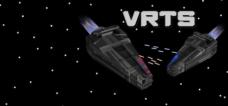
VRTS is a VR Real-Time-Strategy game based in space! Command and construct a fleet of spaceships to defeat your enemies. Watch over the battle from your war table and make the ultimate strategy to bring down your adversary.
$0.991 user reviews
ActionSimulationStrategy
Micahiscoo, redshirtrichMay 6, 2026