Scoring genre clarity...
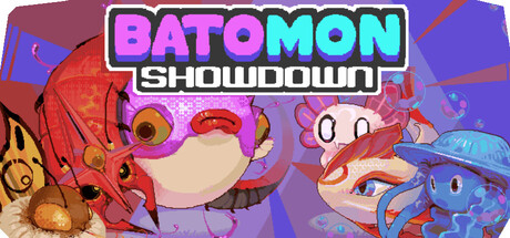
Batomon Showdown capsule

Batomon Showdown

Creature-collecting pvp async auto battler where you choose your trainer, select your Batomon and assemble the ultimate team to take down other players! Play at your own pace while you discover new deadly team combos and synergies! Break the game by training your Batomon to overpowered levels.

$14.99Very Positive(879)
Auto BattlerCreature CollectorAsynchronous Multiplayer
berrymintSep 15, 2026

Batomon Showdown scores 83/100 — better than 97% of Auto Battler capsules (n=564).

Very Positive (879 reviews) · $14.99 · Released Sep 15, 2026 · By berrymint

Quick text summary

Batomon Showdown scored 83/100 on Steam Analyzer — Good for a Auto Battler capsule. Top priority fix: [genre_clarity] Add subtle visual element suggesting team assembly or strategy (e.g. overlapping card silhouettes or UI hints) to differentiate from standard creature-catching games

Capsule scores by dimension

  • Genre Clarity: 8/10 — Clear creature-collecting battle game. The capsule immediately communicates creature-collecting and PvP battle themes through colorful cartoon monsters, vibrant character designs, and competitive visual energy. At tiny size, the bold character silhouettes and neon-bright palette still read as a casual strategy battler with clear personality. The cartoony art style and creature focus leave no ambiguity about genre, though the specific async auto-battler mechanic is not visually signaled.
  • Title Readability: 9/10 — Excellent title legibility throughout sizes. BATOMON SHOWDOWN features thick, high-contrast neon magenta and cyan lettering with a bold white outline that remains crisp and readable even at tiny thumbnail size. The title is centered, elevated above cluttered elements, and the large letterforms with strong color separation ensure no collapse at small viewing. The two-word structure with clear hierarchy makes it instantly scannable during quick scroll.
  • Contrast & Color: 9/10 — Outstanding pop against dark background. Neon magenta and cyan title text create exceptional value contrast and saturation against the dark Steam background, while the hot orange and red creature elements in the foreground generate strong warm-cool separation and silhouette clarity. At tiny size, the bright saturated palette and clear light-dark edges ensure the capsule stands out significantly in a list. Grayscale test confirms strong value separation between title, creatures, and background areas.
  • Uniqueness & Polish: 8/10 — Distinctive art style, polished execution. The capsule demonstrates premium craft with expressive character designs, intentional neon color palette, and a cohesive cartoon art direction that feels intentional rather than templated. The creatures have clear personality and the composition tells a visual story of competitive action and team assembly. While creature-collecting is not new, the specific visual voice and vibrant treatment elevate it above generic competitors in the indie space.
  • Brand Consistency: 8/10 — Strong visual identity, recognizable palette. The neon magenta-cyan color scheme, bold outlined typography, and expressive cartoon creature art create a distinctive and internally consistent brand voice that would be recognizable across store pages. The playful character expressions and vibrant energy are cohesive cues that establish a memorable identity. The style is cohesive enough that the brand would be recognizable if seen again, though specific iconic motifs are not yet crystallized.
  • Composition: 8/10 — Strong hierarchy, clear focal point. The composition uses effective depth layering with background color gradients, mid-ground creatures, and foreground character prominence that guides the eye naturally from left to right. The title anchors the top with authority and the creatures below create visual interest without competing for attention. At small and tiny sizes the composition remains balanced and readable with no critical elements lost to edge cropping or Steam safe margins.

What works

  • Title legibility at all sizes. Bold neon lettering with thick white outline ensures BATOMON SHOWDOWN remains crisp and scannable from full header down to tiny 120x45 thumbnail.
  • High saturation palette pops distinctly. Neon magenta, cyan, and warm orange colors create exceptional contrast against the Steam dark background and stand out during quick scroll.
  • Expressive character design communicates personality. The creature faces and poses convey playfulness and competitive energy, supporting the casual strategy battler positioning without requiring text.
  • Balanced composition with clear hierarchy. Title anchors the top, creatures occupy mid-ground without clutter, and depth layering guides the eye effectively across all viewing sizes.

What hurts the capsule

  • Async auto-battler mechanic not visually signaled. While the genre is clear, the specific twist of async turn-based gameplay and strategic team synergies are not communicated through visual design language.
  • Multiple creatures compete slightly for attention. At full size the left creature and right creature have similar visual weight, which could dilute focal point clarity though this resolves at smaller sizes.
  • Background color transitions lack specificity. The purple-to-blue gradient, while attractive, is a generic backdrop that does not reinforce game theme or world identity compared to top-tier competitors.

Priority fixes

  1. [genre_clarity] Add subtle visual element suggesting team assembly or strategy (e.g. overlapping card silhouettes or UI hints) to differentiate from standard creature-catching games
  2. [brand_consistency] Develop an iconic symbol or recurring character motif that can anchor future marketing and become instantly recognizable across store listings
  3. [composition] Consider anchoring background with thematic environment (arena, battle stage, or team selection interface) rather than generic gradient to strengthen visual storytelling

Store copy priority fixes

  1. [hook_strength] Rewrite the short description opening to lead with a clear emotional verb or outcome before layering genre tags: e.g., 'Outsmart other players by building unstoppable Batomon teams in this creature-collecting auto battler' instead of starting with jargon.
  2. [uniqueness] Add a sentence emphasizing the asymmetric player-made team variety as a differentiator: 'Face an infinite variety of player strategies, ensuring every battle feels fresh and unpredictable' to position this against static AI or limited opponent rosters.
  3. [feature_communication] Explicitly mention the roguelike or run-based progression system in the detailed description (currently missing despite being a featured tag) to close the tag-to-description gap.
  4. [tone_match] Fix the typo 'cook new types onto of your Batomon' to read 'cook new types onto your Batomon' to restore polish and consistency.

Related guides

Steam app ID: 4557380 · Tags: Auto Battler, Asynchronous Multiplayer, Creature Collector, Strategy, Deckbuilding