Scoring genre clarity...

Five Nights at Carson's capsule

Five Nights at Carson's

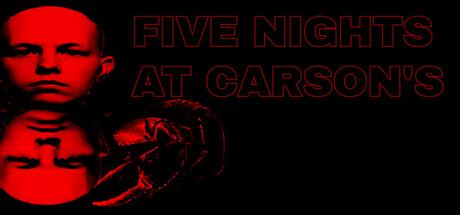
Survive the night in this point-and-click horror experience featuring bizarre, real-life inspired characters. Expect tense gameplay, unexpected scares, and a mix of horror and humor that keeps you on edge.

$2.991 user reviews
Immersive SimSimulationPoint & Click
GiraffeFuneralApr 23, 2026

Five Nights at Carson's scores 65/100 — better than 11% of Immersive Sim capsules (n=1,550).

1 user reviews · $2.99 · Released Apr 23, 2026 · By GiraffeFuneral

Quick text summary

Five Nights at Carson's scored 65/100 on Steam Analyzer — Solid for a Immersive Sim capsule. Top priority fix: [title_readability] Thicken the title outline stroke or switch to solid-fill letterforms to maintain clarity at 120×45 thumbnail scale without outline degradation.

Capsule scores by dimension

  • Genre Clarity: 7/10 — Horror game identity clear. The red-tinted face and menacing character silhouette on the left immediately signal horror/thriller gameplay, and the eerie aesthetic aligns with survival horror expectations. At tiny size, the bold red-on-black value contrast maintains recognizable horror visual language, though the specific 'point-and-click simulation' subgenre is not obvious from visuals alone.
  • Title Readability: 5/10 — Title partially readable at small sizes. The outlined red text 'FIVE NIGHTS AT CARSON'S' reads clearly at full size with good stroke definition, but at tiny size (120×45), individual letterforms begin to blur and the outline stroke becomes thin relative to x-height. The title placement in the upper-right works compositionally, but the decorative outline style loses clarity when scaled below small capsule dimensions.
  • Contrast & Color: 8/10 — Strong red-black separation. Bright saturated red (#FF0000 range) against pure black background creates maximum value contrast and silhouette clarity that holds at all sizes including tiny. The monochromatic red palette prevents mid-tone muddiness and ensures the character face and hand remain distinctly visible even under quick-scroll conditions; grayscale test shows clean edge separation.
  • Uniqueness & Polish: 6/10 — Competent but derivative horror styling. The red-tinted face and horror poster aesthetic execute the genre formula cleanly without major craft flaws, but the approach mirrors common survival-horror capsule conventions (high-contrast face, ominous silhouette). No distinctive visual hook, unique character design trait, or gameplay mechanic is visually communicated that would differentiate this from other horror titles in the storefront landscape.
  • Brand Consistency: 6/10 — Generic horror palette without signature identity. The red-and-black color scheme is internally cohesive and consistent with the horror genre expectation, but there are no memorable iconographic elements, character traits, or visual motifs that would make this recognizable as 'Carson's' specifically across future marketing materials. The rendered style is uniform, but lacks a distinctive brand hook.
  • Composition: 7/10 — Clear focal point with safe layout. The character face anchors the left side as primary focal point, while the hand silhouette provides secondary interest and depth layering without competing for attention. Title placement in upper-right avoids center clutter and leaves safe margins; however, the right half of the capsule is mostly empty black space, which is intentional but slightly underutilizes composition real estate for a 231×87 small capsule footprint.

What works

  • Excellent red-black contrast. Maximum value separation ensures the character silhouette and title remain sharp and readable across full, small, and tiny viewing sizes without mid-tone degradation.
  • Horror genre immediately recognizable. The menacing red face and eerie aesthetic signal survival-horror or supernatural gameplay to viewers in under one second, establishing correct genre expectations.
  • Safe margins and focal hierarchy. Character face on the left provides clear primary focus, title placement avoids edge crop risk, and secondary hand silhouette supports without competing for attention.

What hurts the capsule

  • Title outline loses legibility at tiny size. The decorative red outline style becomes thin and blurry when scaled to 120×45 thumbnail, reducing word recognition speed for quick-scrolling users.
  • No distinctive brand or unique hook. Generic horror poster formula with no memorable character trait, signature visual motif, or gameplay-specific design element that differentiates this from dozens of similar indie horror titles.
  • Wasted composition space on right side. The right half of the capsule is nearly empty black space, missing an opportunity to add secondary visual storytelling or reinforce the game's unique identity.

Priority fixes

  1. [title_readability] Thicken the title outline stroke or switch to solid-fill letterforms to maintain clarity at 120×45 thumbnail scale without outline degradation.
  2. [uniqueness_polish] Add a secondary visual element or environmental detail (e.g., office/animatronic cue, game UI hint, distinctive prop) to the right composition area that signals the game's specific 'Carson's' identity and point-and-click simulation nature.
  3. [genre_clarity] Incorporate a subtle game-specific visual cue (gameplay interface frame, satirical prop, or character-specific detail) that hints at the point-and-click simulation mechanics beyond generic horror aesthetics.

Store copy priority fixes

  1. [uniqueness] Add 1-2 sentences to the short description explaining what makes the character roster or gameplay loop different from the original FNAF—e.g., 'Play as your friends in a twisted comedy-horror remix' or 'Encounter unpredictable, personality-driven enemies inspired by real people.'
  2. [feature_communication] Expand the detailed description to include 2-3 additional sentences about progression (Do difficulty levels unlock?), replayability (multiple nights/endings?), and game length, so players understand the full scope.
  3. [genre_clarity] Move the FNAF fangame context to the first paragraph of the detailed description to set expectations early and avoid confusion for players unfamiliar with the original.

Related guides

Steam app ID: 4559320 · Tags: Immersive Sim, Simulation, Point & Click, 2D, Horror