Scoring genre clarity...
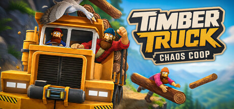
Timber Truck: Chaos Coop capsule

Timber Truck: Chaos Coop

A physics-based co-op adventure about the worst logging crew alive. Chop trees, load them onto one shared truck, and haul them home through rivers, wrecked bridges, and a goose who wants you dead. Simple work, total chaos – best played with friends!

SimulationCasualAction
Pitstop PanicComing soon

Timber Truck: Chaos Coop scores 85/100 — better than 95% of Simulation capsules (n=6,076).

Released Coming soon · By Pitstop Panic

Quick text summary

Timber Truck: Chaos Coop scored 85/100 on Steam Analyzer — Excellent for a Simulation capsule. Top priority fix: [composition] Increase negative space around the truck or reduce log particle density to create a clearer visual hierarchy and breathing room at small sizes

Capsule scores by dimension

  • Genre Clarity: 9/10 — Physics chaos co-op crystal clear. The yellow logging truck prominently centered, flying logs mid-air, and character interaction instantly signal a physics-based vehicle game with comedic tone. At tiny size, the truck silhouette, bright yellow color, and chaotic debris remain unmistakably recognizable as a vehicle-based sandbox game. The bright blue sky, cheerful character, and destruction motif eliminate any ambiguity about genre.
  • Title Readability: 9/10 — Bold yellow logo reads perfectly. The TIMBER TRUCK title uses a thick, outlined yellow sans-serif font positioned in the top right on a clean blue sky background, ensuring maximum contrast against the dark Steam background. CHAOS COOP tagline sits clearly below in a smaller weight, maintaining legibility even at tiny size due to the outline treatment and color choice. The logo placement avoids the busy truck and character, keeping text separation clean.
  • Contrast & Color: 9/10 — Vibrant yellow truck pops crisply. The bright yellow truck creates strong value separation against the deep blue sky and dark Steam background (#1b2838), with warm orange highlights on the cabin adding depth without losing clarity. The orange-yellow-blue color harmony is saturated and avoids muddy mid-tones, and the character in red adds a secondary pop that guides attention. At tiny size, the yellow truck remains the dominant focal point with no blending or loss of silhouette definition.
  • Uniqueness & Polish: 8/10 — Polished art style with personality. The cartoon 3D rendering style is clean and intentional, showing a distinctive visual identity distinct from generic simulation covers, with exaggerated physics and character animation conveying the game's comedic chaos promise. The flying logs, visible character expression, and dynamic truck tilt all suggest core mechanics rather than static scenery. Minor polish loss comes from the composition feeling slightly busy, but the execution quality is clearly above baseline.
  • Brand Consistency: 8/10 — Consistent bright cartoon aesthetic. The cheerful yellow truck, bold sans-serif branding, and playful character rendering align with a cohesive indie co-op identity that should be recognizable across marketing materials. The warm color palette (yellow, orange, red, blue) and friendly proportions suggest a memorable visual style without being derivative. The capsule effectively communicates the 'chaos with friends' brand promise through visual tone and energy.
  • Composition: 8/10 — Strong hierarchy, truck dominates center. The yellow truck occupies the prime center-left area as the clear focal point, with the character and logs creating dynamic depth in the middle ground and sky providing breathing room above. The title placement in the top right balances composition without competing with the truck. At small size, the design maintains clear focus on the truck with supporting elements guiding rather than scattering attention; at tiny size the truck silhouette and title remain perfectly legible.

What works

  • Bright warm palette pops on Steam dark. Yellow truck and orange highlights create maximum contrast against #1b2838 background, ensuring instant visual impact during quick scrolls.
  • Title logo uses strategic outline treatment. The bold outlined yellow sans-serif holds legibility at tiny size and sits cleanly on blue sky, avoiding overlap with busy truck details.
  • Genre communicated through dynamic visuals. Flying logs, truck tilt, and character mid-action instantly signal physics-based co-op chaos without needing to read any text.
  • Polished 3D cartoon style feels premium. Clean rendering, intentional proportions, and character personality demonstrate craft quality above generic asset-based covers.

What hurts the capsule

  • Composition borders on visual clutter. Multiple attention points (truck, character, logs, effects) compete slightly for focus, though the truck wins; at full size the design reads busier than necessary.
  • Character and log details soften at tiny size. While the truck silhouette remains crisp, the player character and flying logs lose definition at thumbnail scale, reducing the sense of action.

Priority fixes

  1. [composition] Increase negative space around the truck or reduce log particle density to create a clearer visual hierarchy and breathing room at small sizes
  2. [contrast_color] Consider a slightly darker or more saturated background tone behind the title to ensure CHAOS COOP tagline maintains full readability at the smallest sizes without relying solely on outline

Related guides

Steam app ID: 4561930 · Tags: Simulation, Casual, Action, Arcade, Party Game